


Hanna Pichkur
Copywriter, SMM specialist
Live your life in such a way that people will smile when they run into you, and they will be a little happier when they talk to you.
Stack
-

Adobe Photoshop
-

Bitrix framework
-

Google My Business
-

Figma
-

Canva
-

Adobe Illustrator
- What the client's business is. What kind of product or service, what the specific is.
- About the task set before us (website development, SMM, video, etc.).
- About the method of implementation. What we did, what features were introduced, how long it took.
At the end of each project, there is a brief introduction: a link to the site, terms and cost of development, technologies used. All elements of the portfolio are provided with screenshots, which clearly show the result — even without reading the text, clients receive comprehensive information about the project.
We optimize each post in the portfolio for a specific cluster of requests, corresponding projects. Unsurprisingly, portfolio pages are the most visited on the Webnauts site.

Posting Reviews
The Webnauts website only publishes reviews from our customers. All of these reviews come from real people for whom we have performed various tasks. Under the text of the review there is a link to the project or case in the portfolio, so anyone can evaluate the results of our work.

We always ask customers to be as honest as possible in their reviews. And we work out all the arising objections already at the stage of cooperation. The block with reviews is displayed on the main page of the site.
Blogging
A blog is one of the main tools for SEO promotion of a marketing agency or an IT company. When we created the blog, we set ourselves the goal of «telling simply about complex things»: we want to share our knowledge and experience, and the company’s blog suits best for this purpose.
For our blog we:
- Defined the target audience. Our materials are primarily for clients interested in Internet marketing services, website development, business promotion. However, digital specialists can also draw useful information from them.
- Created headings. There are three of them: cases, news and articles. Each section is designed for a specific format of publications. We update them regularly.
- Established uniform layout standards. Content makers publish materials in compliance with these rules. Each blog page has a promo button for one of our services, a capture block, links to categories, and recent posts.
- Developed a content plan. We regularly discuss which cases are worth sharing, which topics may be of interest. As a result, we determine what and how we will write about.
We talk about new blog posts on the Webnauts Facebook page.

Our cases
Case studies are one of the most powerful internet marketing tools. Our cases define the task, reveal the solutions and communicate the final result we have arrived at. We illustrate all actions with screenshots of reports and data from analytics programs.
Case value:
- Demonstrate knowledge and understanding of the task;
- Show that we have experience with a specific task;
- They serve as proof of the effectiveness of the chosen solution.

The difference with the Portfolio is that case studies do not show the whole project, but a specific problem. They describe how we got from point A to point B and what we did along the way. Case studies are not only useful for business owners — they can be adopted by other marketers.
Our cases are made up of several parts. First, we identify the problem, describe the solutions, demonstrate the result and draw a conclusion. The final figures are highlighted in large print so that they are more noticeable.
News from the digital world
The digital sphere is constantly changing, so any specialist needs to follow trends. Even at the stage of discussing the concept of our blog, we chose the news format and decided that such a section would definitely be on our website.
The blog mainly publishes news in the following areas:
- Updates, new functions and features of social networks;
- Developments, services, functionality and new search engine algorithms;
- New popular messengers;
- Interesting events in the digital sphere.
All news are provided with thematic illustrations, screenshots or videos.
Useful articles
Information materials are not published in our blog very often. We carefully approach the choice of topic and try to share our practical experience. So we created the guide «How to write a technical task for a landing page», the article «5 Things Good Internet Marketers Won't Tell You» and many other materials.
In each article, we try to correctly combine:
- SEO tools. Keywords, meta tags, subheadings, lists, sidebars, linking and other components of the right SEO text.
- Design and dynamic elements. We follow the style of the site and add animation. We grab the attention of the reader, do not let them get bored.
- Text for the people. We try to talk with the reader, to advise, not to teach. We do not have water in our articles and give maximum benefit.
- Honesty. We do not write about what we do not know or have not experienced.
The result of complex work
If you want to promote the site of an IT agency / digital company in search engines the way we did at Webnauts, you need to use all available marketing channels. This is a long systematic work, which in the end will pay off and will definitely bring customers.
Here the results of keyword visibility rising:

Here the results of organic traffic:

Crazy Fish is an online fishing store specializing in spinning rods and silicone lures. We had already developed a website for them and redesigned the blog, which allowed us to attract visitors. But there is always room for growth — thanks to competent SEO promotion, this time we were able to increase traffic by 55% in 3 months.
Internal optimisation
In the first two months of work, we carried out technical internal optimization of the site and its work, eliminated the accumulated bugs. This is the basic action required for further SEO promotion in search engines:
- removed duplicate pages;
- changed the menu;
- set up redirects and canonical pages;
- fixed sitemap;
- set up robots.txt;
- found 404 pages and removed from the search;
- filled in and corrected meta tags.
After the measures taken, it was possible to proceed to the promotion of individual positions.
Compilation of the semantic core
We analyzed the SEO solutions of competitors and assembled a semantic core with search suggestions, filtering from duplicates, non-targeted and junk queries. Requests were divided into groups for further content planning.
In addition, this allowed us to develop an element for generating landing pages with static URLs for low-frequency keywords. We have also prepared several sub-pages.
The results
Before the start of the promotion, visits to the site were of a branded nature: visitors purposefully searched for products by brand. We took previously unused semantic clusters (groups of low-frequency queries) and implemented pages by product type. Thanks to these actions, traffic began to grow for «non-branded» queries.

The overall site traffic increased from 12,500 visits in December to 22,500 visits in April. SERP Results:

The overall site traffic increased from 12,500 visits in December to 22,500 visits in April.

A few words about the project
The online store of modern accessories for electronics has been our regular customer since 2014. Over the years, we have developed a warm and trusting relationship with the customer, so we are happy to tell everyone about how we carry out a comprehensive promotion of this site, paying attention to several areas at once, among which we can note: SEO, crowd marketing, SMM, site speed optimization , content, usability improvement.
This online store has been maintaining its leading positions in many highly competitive queries in Ukraine for a long time and continues to strengthen its positions in search engines. All this is thanks to the well-coordinated work of our «Webnauts» team, from designers to copywriters.
How to achieve good results in search promotion for the Ukrainian region, how to promote an online store website, how much it costs and much more: all these you will learn from this case.
Features of promoting an online store in the region "Ukraine"
The key to the success of any online store lies in its comprehensive promotion, which we successfully demonstrated using the example of Bilka. Over several years of fruitful cooperation, we tried many different ways of promotion, but the main efforts and budget were eventually directed to long-term «slow» methods, the results of which were gradually displayed in increasing the traffic of the resource from organic search.
This method is the most time-consuming and costly, but also more reliable, because in this case the site confidently takes its positions and will not lose them even if the development of the project is suspended.
The peculiarity of promoting the site of an online store in the region «Ukraine» is that after the deterioration of the political situation and the ban on the use of many Russian resources and services (primarily this applies to the Yandex search engine), Ukrainian users prefer to look for answers to their questions in Google, therefore, the main emphasis in the promotion of the online catalog of accessories for mobile devices «Bilka» was placed precisely on this search engine.
It's no secret that Yandex and Google have different algorithms for the distribution of resource positions for a particular request, so the promotion of this online store is aimed at meeting Google's requirements in the first place. After blocking in Yandex (May 2017), the share of visitors from this service decreased to 5% of the total, although the popularity of the Russian service used to be very high in Ukraine (see chart).

A comprehensive approach to promoting an online store
Our SEOs and copywriters from Webnauts are constantly working to increase the attractiveness of the site not only for search engines, but also for visitors. We are regularly engaged in the creation of high-quality materials; in our list of priority work, SEO-optimization of the site occupies the first position. Among the most important procedures, the following is worth noting:
- creating SEO texts and meta tags in all sections of the site;
- filling out cards for new and existing products;
writing competent SEO texts for static pages; - creating a sitemap;
- creation and regular updating of the «News» section with relevant thematic materials;
- setting up the fastest indexing of new pages;
- integration with monitoring and optimization services of Google;
- adding an online store to all major business directories;
- optimization of code and images to speed up loading speed.
Features of filling the online store
An important factor in ranking an online store in search engines, including Google, is the quality content of the site. First of all, you need to pay attention to the main sections, resource categories, static pages, optimize not only meta tags, but also other textual information on each page.
Most online stores in Ukraine have filters in their product catalogs that help you quickly find the right product, compare and buy it. It is very important to organize SEO-optimization of these filters so that a potential buyer can find what they want in just one click from organic search.

Link building, link profile
One of the most important factors for the successful promotion of an online store in Ukraine is link building. And it should be good quality and natural. Since no one promotes online stores exclusively with natural links, we also used some tricks, among which crowd marketing is one of the most successful and effective methods of obtaining targeted visitors and natural links.
There are several people among the Webnauts staff who develop and maintain profiles on specialized forums on various topics. Depending on the tasks set, they make hidden advertising, describe the positive aspects of a particular site, store, advise, share their opinions and recommendations. Promotion through crowd marketing has proven itself in absolutely all areas, including electronics, accessories for which are successfully sold on the website bilka.com.ua
Article promotion also does a great job of building backlinks. This method has always been and remains one of the most effective, because you can choose which pages of the promoted site will have links, in which text (you can write it yourself), on which specific site they will be placed. It all depends primarily on the size of the budget, but even inexpensive links from articles will have a very positive effect on the attitude of search engines to the site.
Natural links speak for themselves, they are indirectly related to promotion, because they are an indicator of the quality of the site and its relevance in the selected category. In other words, if the online store is good, the site is fast and convenient for buyers, they will talk about it, reviews will scatter over the Internet, thereby increasing the number of natural backlinks. This is a nice bonus that every high-quality and optimized site receives. This factor increases the motivation to create a good online store, such as, for example, bilka.com.ua.
Social media also have a big influence on positions in search engines, so we pay a lot of attention to the development of store profiles in popular networks. Backlinks in this case serve as a source primarily of the target audience, which has a positive effect on the overall picture of the behavioral factors of the online store

Responsiveness, usability
Effective promotion of an online store today cannot do without adaptive layout and universal design. More than half of potential customers access search engines through their mobile devices (see statistics on the image), so the site should work correctly on absolutely all known display resolutions. We solved this problem successfully and bilka.com.ua looks great on any gadget, as evidenced not only by satisfied customer reviews, but also by screenshots next to this text.
Since behavioral factors are very important in the promotion of any Internet resource, we also tried our best in the case of Bilka — our designers have developed an excellent interface, which we regularly refine and make better, taking into account customer reviews.
Summary
Online store «Bilka» has been one of the best regular customers of «Webnauts» for several years, because it allows from the very beginning of our cooperation to use as many ways in promoting the resource as possible, which greatly facilitates achieving results. Over the years, we have done a lot of important and useful work, we continue to modernize and improve this online store. And even if the cost of such promotion is much higher, an integrated approach gives reason not to doubt the results, which are reflected in the growth of profits and increase in the growth of visitors (see the chart below)
The price of our services is justified by such results and we hope that SEO promotion of an online store in Ukraine will be of interest to many business owners and they will turn to real professionals in their field.

About the project
AVOCADO CLINIC is our client from Kremenchuk, a modern dental clinic that relies on the use of innovative technologies, a high level of professionalism and quality of services. AVOCADO CLINIC has been on the market for 10 years and during this time specialists have helped more than 20 thousand patients. It's time for us to help the clinic and create a cool product for it - a dentistry website with an individual design. About how it was, and what solutions we proposed and implemented, read below.
https://wnauts.com/wp-content/uploads/2021/11/avocado-clinic-video.mp4The objective
We were given the task of creating a business card website for a premium class dental clinic. The overall structure of the site should reflect the quality of services, and the color scheme should match the finished company logo. Also, our task included basic SEO-optimization of the site for local Google issuance.

Solution
A team of our specialists has developed a website according to the aim. And the first thing we focused on is individual design.We have created a custom grid to make the site look modern and elite. The emphasis of the clinic is premium services, and the best tools to emphasize this are the big elements.
Among other things, when developing and creating layouts, we used large informative photographs to attract the user's attention. We selected from the clinic's photo bank those photos that are able to establish connections and associations with the main values of Avocado Clinic - premium quality, care of patients, safety and comfort. Photos play the main role of quickly perceived content: the client will receive what he sees on the screen. And this is: healthy and happy smile, friendly staff, cozy atmosphere of the clinic. This visual technique has long proven itself as an aid to successful sales.

A large photo in web design is already an established norm, but our designers understand that photos alone are not enough for a winning result. More importantly, the rest of the elements are harmoniously arranged. So, for example, in the background you can see an image of a tooth (as a picture) — this is a small reference to the theme of the site.

The color scheme is selected in accordance with the ready-made logo provided to us. Turquoise often appears in the list of trending colors for web design, and this color has proven itself in the psychology of the influence of color on website conversion — it works effectively when selling specialized services, especially in the medical and aesthetic fields.

When developing the clinic's website, it was important to focus on the service of total prosthetics «Full Total», because. this is a flagship service that not all competitors can boast of. This is a complete smile rehabilitation and replacement of lost/extracted teeth. The service is mentioned on the main page of the site several times along with the cost in order to attract the attention of the client and gain his trust.

We also used creative motion design as one of the important components of UX. Animation creates the feeling that the action is being completed faster than usual, and this makes the site even more modern, showing the user that their time, even spent on the site, is valued here. All moving elements not only attract attention, but also make visible the conceptual connection between page elements.
All micro-interactions are short and purposeful. We moved away from robotic linear animation from point A to point B and used more interesting transitions.
Adaptability
It seems that a site with an abundance of large elements is difficult to adapt to devices with a small screen. But it is the enlargement that plays into the hands of the mobile version of the site — these are both large buttons and a readable font. We also saved animation and all the most important sections of the site for smartphone users.

SEO optimization
The «Semantic Team» of Webnauts optimized the site for search engines: we assembled the semantic core and thought out the site structure taking into account SEO queries, prescribed the necessary headings, loaded the XML map for proper indexing. We also made all the necessary indexing settings in the robots.txt file in order to “tell” search engines which pages to crawl.
We are sure that in the conditions of low regional competition, the performed optimization actions will ensure that the site gets into the TOP-10 for a number of queries. And without significant investments in SEO. The effect of the described actions is expected in a few months - we will definitely share it with you in future cases.
Other features
Useful articles
We have added a blog to the site structure to post useful articles on dental topics for additional SEO optimization. Also, the articles on the site are additional «weights» on the scale of decision-making in favor of treatment or diagnosis.

Unobtrusive interface
We decided not to use pop-up contact forms, leaving the decision on the appointment to the user. For communication, we have implemented the «Free ONLINE consultation» button at the top of the screen.
At the bottom of the site, we added a simple «Contact Us» form with three fields and one button — it turned out to be as simple and unobtrusive as possible.

The team
In the «About us» section and on the main page of the site, you can find a photo and description of the clinic team with full name. We didn’t use stock photos of dentists with a Hollywood «cold» smile, but real photos of the clinic team — simple and not staged, in a working atmosphere. All this gives the brand a human face, which is characterized by such features as sincerity, self-irony, frankness and others.

Certificates
We decided not to hide the merits of each individual member of the Avocado Clinic team, but to bring awards and documents to a prominent place. Such decisions are made not to boast, but to form additional trust and loyalty of the client. «We operate transparently and legally. You have nothing to fear. Professionals are with you» — this is what the «Certificates» block is about.

Summary
We got a concise, not overloaded with unnecessary information, well micro-animated site with high-quality typography and thought-out composition. The color scheme, transparent price list and unobtrusiveness complete the formation of a pleasant impression of the site.
All our work was aimed at making the user feel trustful, safe and clean, and for them to understand that they are on a site with premium and expensive dental services.
[post_title] => Dental Clinic Website Development [post_excerpt] => [post_status] => publish [comment_status] => open [ping_status] => closed [post_password] => [post_name] => dental-clinic-website [to_ping] => [pinged] => [post_modified] => 2023-09-14 17:02:22 [post_modified_gmt] => 2023-09-14 14:02:22 [post_content_filtered] => [post_parent] => 0 [guid] => https://wnauts.com/?post_type=project&p=9124 [menu_order] => 0 [post_type] => project [post_mime_type] => [comment_count] => 0 [filter] => raw ) [4] => WP_Post Object ( [ID] => 16524 [post_author] => 10 [post_date] => 2022-08-26 14:04:19 [post_date_gmt] => 2022-08-26 11:04:19 [post_content] =>The objective
Meet another Webnauts project — IOD (Intellectual Outstaffing & Development), which provides outstaffing and outsourcing services. And which badly needed a modern and user friendly platform.
- What for? To sell the services of IT specialists.
- Who for? For Western companies that want to quickly hire the right specialist and make the right choice.
By answering these questions, we managed to create a convenient and practical website that qualitatively presents (and therefore sells) the IT team and solves the problems of customers.
How did we do it? More details in our case.

Interface design
The main treasure of an outstaffing company is its team, and if the team comes from Ukraine, this is the dream of any Western client. It's no secret that Ukrainian IT specialists are one of the most sought-after specialists due to their high professionalism and low level of claims for payment, which cannot be said about their colleagues from the USA and Europe. Due to Russian aggression, the Ukrainian IT sector found itself in difficult conditions, but it has not ceased to arouse interest and attract even more attention from the world. Therefore, the main task of the designers was to introduce the site's guests to the team of potential performers from the first screen: IT professionals from Ukraine.
Call to Action (CTA)
Another important advantage of outstaffing is saving the client's time in finding the perfect employee. On the site, the slogan speaks about this, the button shouts and the gallery with candidates calls for viewing, and it all from the first screen. At the same time, the design is not overloaded at all: there is a lot of air here and everything is clear even for those who do not understand anything about outstaff and outsourcing.

Mega menu for navigation
The second screen offers more opportunities for searching for an employee both by a separate direction («Profession»), and by a specific technology («Technology»). And all thanks to clear search navigation in the form of a mega menu with two sections. So, we presented a block with IT areas in the form of a small plate of 4 points, each of which is tied to a gallery of specialists.
The list of technologies is much wider, so we abandoned a bulky vertical list and placed the categories line by line, adding the «See more» button. This technique is much more efficient in terms of appearance and ease of navigation:

Site search filter
Clicking on the «See all» button or on any of the technologies takes the user to the «Specialists» page, where the possibilities of finding an employee are even wider due to additional filters, such as «Specialization», «Experience», «English level» and «Available» in slider:

Drop-down list
The next block introduces site visitors to the company's services. We designed it in the form of a concise drop-down list with preview arrows. This technique simplifies the interface, focusing on the important, but if desired, allows you to easily access information and reveal additional information in one click:

Company page
The «About us» block allows you to learn more about IOD. Here the text is supported by a photograph and large numbers in the best traditions of Swiss typography. The big button encourages you to get to know the company even closer and takes the user to a separate page of the same name:

It is not only about UX
The next screen is more about UI, not UX, and is a bright and logical continuation of the «About us» block. If earlier the white color played the main role on the site, forming «air» between the elements, and blue only gave an accent, here the blue color sets the tone for the entire composition. It is associated with reliability, safety and trust, which perfectly characterizes the company. In addition, for a clear reason, the blue color is dear to every member of the team, and together with the «Glory to Ukraine» ticker, once again emphasizes the company’s belonging to Ukraine:

List in a table
The «Outstaffing benefits» block in the form of a concise table reveals the benefits of outstaffing using the example of cooperation with IOD:

Applying for a team
The following block offers clients to hire a ready-made team for a project: be it a website, a mobile application, an individual design or a comprehensive promotion. The client can get a proven team in just one click:

Grid in design
The site design is based on a non-standard 16-column grid with two guides, according to which all blocks and interface elements are located. All content is divided into 2 halves (on the left is the heading, and on the right is the main text), making it much easier to perceive information. The composition also has a rhythm due to the alternation of headings (either on the left or in the center), which gives the interface a kind of dynamics:

This is how the designers brought clarity to the outstaffing model with the help of a visual language and reduced a rather complex form of labor relations to a simple and attractive service.
Text content of the site
Having talked about the visual language, we cannot but mention the textual content. After all, if the task of good design is to convince the user to stay on the site, then the task of high-quality content is to convince them to buy. Anyway, a potential client will eventually move from scanning the site to studying it.
Webnauts copywriters tried to make the site of the outstaffing company not only easy to use, but also understandable. Getting acquainted with the platform, the user can first pay attention to well-aimed headings and thus understand the navigation, and then move on to concise and simple texts.
The accessible content of each page allows the user to quickly understand the subject of the site, easily understand the conditions and benefits, increase confidence in the company and use outstaffing services.
Interface coding
Where design ends, front-end development begins.
HTML, CSS and JavaScript are the three pillars of the front-end on which the user interface stands. With the help of these languages, we have turned design layouts into a tangible web product.
In order to simplify and structure the code, we used a kind of CSS extension — the Sass preprocessor scripting language and its SCSS syntax. And to insure the code from errors and make the site work properly, we were helped by the Git (Global Information Tracker) version control system.
However, this is not all. The front-end development was based on the Vue.js JavaScript framework, as well as the Nuxt.js Vue.js framework. These technologies allow you to create powerful web applications for Vue.js, including Alibaba, GitLab, 9Gag, and now the IOD website.
In addition, in the development of the client part of the platform, we used such libraries as:
- Vuex — for managing the state and storing site data.
- Vue router — to sync the site URL with the rendered web page.
- vuejs-paginate — for paginating the site.
- vue-click-outside — to respond to clicks outside the interface element (in our case, this is a dialog box with an application form):

- nuxt/i18n — to adapt the application to the user's language.
- cookie-universal-nuxt — for setting, receiving and deleting cookies.
- nuxtjs/svg-sprite — for uploading SVG files to site pages on Nuxt.js.
- nuxt-ssr-screen-size — to control the screen size between responsive and desktop versions.
- v-scroll-lock — to block the scrolling of the site page when the modal window is open:

- Swiper — to implement a touch slider.
Thanks to the Nuxt Sitemap module, we have created a sitemap, an important document in terms of SEO. It contains a list of all web pages and helps search bots crawl the site.
Animation
Animation continues to be one of the top trends in web development. In our works we use unobtrusive effects, but in this project we have relied on a special dimensionality.
The minimalistic cursor and the smooth appearance of each element when scrolling slowly guides the user through the pages to properly introduce the team, conditions and benefits. Such animation, as if grabbing the sleeve, allows the client to avoid mistakes and make the right choice, thereby arousing interest and trust. In addition, the use of animation confirms the innovativeness of the service and the fact that the visitor is dealing with an IT company.
To create animations, we used the GSAP (GreenSock Animation Platform) JavaScript library, in particular, and for the smooth appearance of blocks and lines separating content:

Animation Cursor
The sliding decorative cursor in the form of an outline circle enlarges and changes color when hovering over links. This effect was implemented using JavaScript and a linear interpolation function:

Animation on hover
The color change effect on hover increases user engagement and allows them to focus on the content inside the cards:


Slider effect
When you hover over a photo, a slider effect appears and calls up a card with brief information about the specialist, and when clicking on it, the user goes to a separate page with a detailed resume. We implemented this effect using CSS:

Ticker effect
We have already talked about this graphic technique that has been attracting the attention of users since the good old 90s. And again, the ticker broke not only into web design trends, but also into our new IOD project. We implemented the ticker effect using the vue-marquee-text-component library and thus increased the interactivity of the site:

Responsiveness
We have completely taken control of the design and adapted the layouts so that the site looks organic on the screen of any type of device. Sometimes adaptivity requires simplification or even cutting off secondary blocks or animations. However, in this project, we managed to keep all the elements and animation effects.
As a result, we rebuilt the blocks in such a way as to correctly convey the meaning and not violate the logic of the site. In addition, each item is large and clickable, and along with the competent placement of elements, it allows you to effortlessly switch between items and conveniently explore all the content, whatever the size of the display.
A harmonious design responsive to mobile devices is a must have for any commercial site, because more than half of the world's users access web services from smartphones.

Site functionality
Each block and element on the site must obey the user and properly perform its function. Our back-end developer worked hard on this task.
Website admin panel
The admin panel of the site is provided by Laravel Nova from Laravel developers. It has an attractive and understandable panel with convenient content management due to customization:


01
/ 03
Laravel Nova Packages
Laravel Nova has a huge number of plugins that extend its functionality. So, in this project we used the following packages:
- laravel/telescope — for debugging the Laravel framework and monitoring site performance.
- protonemedia/laravel-cross-eloquent-search — for searching across multiple site models.
- classic-o/nova-media-library — to manage media files.
- digitalcloud/multilingual-nova — to switch the site language.
- dillingham/nova-attach-many — for easy editing of linked models.
eminiarts/nova-tabs - for grouping parts and relationships into tabs. - optimistdigital/nova-multiselect-field — to add multiselect to the arsenal of Nova fields.
- optimistdigital/nova-sortable — for reordering models using drag and drop.
- whitecube/nova-flexible-content — for flexible generation of content blocks.
- wehaa/inline-boolean-field-update — for filling and updating checkbox fields online.
waynestate/nova-ckeditor4-field - for editing text areas.
Database
After installing all the plugins, we started creating a complex client-server site architecture - a database and the modules necessary for the site:
- Catalog of specialists with filters. In order for the client to see not only a beautiful, but also a fast-working search filter, we have done serious work and competently structured a huge database with a variety of types of relationships (one-to-many and many-to-many). The most difficult was the implementation of the links «specialist — specialization», «specialist — experience» and «specialist — technology» (many to many). As a result, the site's admin panel now has the ability to easily and quickly create new pages, manage specialists' data, and associate a specialist with a profession, specialization, experience, technology, and English level.
- Static pages. We have created the About us, Contacts and Teams pages, as well as set up content management through the site admin panel.
- Teams. In the admin panel of the site, you can create and manage teams, in particular, add and combine specialists into groups.
- The main page is implemented with a dynamic display of specialists, a mini-catalog and a block with IT teams.
- SEO module. We added SEO data to all pages of the site and implemented an SEO page generator for the catalog with filters. All filter combinations in the directory have unique automatically generated SEO data: slug, title and description.
- Forms. We have implemented a simple and convenient form submission, as a result of which the reception of data from forms is carried out in one form, which can be easily accessed through the admin panel.
Summary
Competent design, high-quality content, modern animation and high functionality — this is the result we expected. Such a site of an outstaffing company is able to impress not only with its design, content and speed, but also with its efficiency.
[post_title] => Custom Software Platform Developed for a Company Based in Ukraine [post_excerpt] => [post_status] => publish [comment_status] => open [ping_status] => closed [post_password] => [post_name] => website-for-an-outstaffing-company [to_ping] => [pinged] => [post_modified] => 2023-09-13 16:51:17 [post_modified_gmt] => 2023-09-13 13:51:17 [post_content_filtered] => [post_parent] => 0 [guid] => https://wnauts.com/?post_type=project&p=16524 [menu_order] => 0 [post_type] => project [post_mime_type] => [comment_count] => 0 [filter] => raw ) [5] => WP_Post Object ( [ID] => 16635 [post_author] => 10 [post_date] => 2022-08-26 09:42:07 [post_date_gmt] => 2022-08-26 06:42:07 [post_content] =>About the project
Profi Make is a villa rental company on the Palm Jumeirah in the UAE.
The company is no less than 12 years old, and of course, during this time it managed to acquire a corporate website. However, over time, the client decided to promote their services under a new brand and create another site. This is how Profi Make met the Webnauts team.
Read about what happened as a result of our cooperation in our case.
The objective
Profi Make is represented on various online accommodation booking services, in particular Booking.com and Airbnb. But the main platform is a corporate website that attracts customers with the help of contextual advertising.
So we had the task of developing a website for the company that would fully correspond to its activities: with an attractive design and competent presentation of content. That is, to make sure that all pages of the site are not just convincing, but obviously emphasize the company's rich experience in the field of luxury real estate.
Technological solution
To develop the Profi Make website, we used the Bitrix 24 CMS constructor. The decision was justified by the fact that the client had already used Bitrix24 as a CRM, and the creation of a site within the same CRM came in handy.
Why is Bitrix24 so good? This is a convenient constructor that allows you to:
- create a design from ready-made blocks and elements;
- create additional web pages;
- optimize the site for promotion;
- get detailed statistics;
- collect customer contacts using built-in CRM forms;
- integrate the site with payment and other external services.
In addition, the speed and cost of developing a site on Bitrix24 is simply pleasing.

Website design and navigation
As we intended, the design of the site turned out to be minimalistic, neat and elegant, as a project for renting luxury villas should be. The color scheme is restrained and consists of 3 colors:
- white is the main background color of web pages. It gives the site elegance and airy lightness;
- sand — an additional warm color with a direct reference to the desert landscapes of Dubai;
- black is the accent color for the main text, header and footer of the site. It is associated with professionalism, maturity and allows you to focus on what is important.
Main page structure
We placed only 3 elements in the site header: a logo and two contacts in the form of a phone number and a link to an Instagram account.
The main screen also has a photo of the Dubai skyline, a laconic slogan and location. All of them aptly and concisely broadcast the activities of the company:

An animated pop-up in the lower right part of the screen unobtrusively reminds you of the opportunity to write to a consultant, and clicking on it instantly brings up a chat window:

By the way, all messages sent from the site instantly get into the Bitrix24 CRM system which our client uses for their further and prompt processing.
Catalog
The very first site of the company had a catalog with a solid block structure and 2 search filters: location (an unnecessary item due to the fact that there is only one option) and the number of rooms. Such a catalog lacked logic, visual appeal and ease of perception.
This time, when developing the catalog, we completely abandoned the navigation bar and immediately structured the villas by the number of rooms. This is the main parameter when searching for apartments, which often determines the cost of rent. We presented the sections of the catalog in the form of a circular slider:

Location Description
As mentioned earlier, all villas have a one and only location — Palm Jumeirah on the coast of Dubai. Copywriters enthusiastically made a laconic description of the island, illustrating it with colorful photographs. To describe the location, we have dedicated a separate screen:

About Us
This is not just a site block, but a brand mirror. It reflects the history, activities and experience of the company. It is able to create an image that deserves the trust of customers, but only with competent text. As you guessed, here, too, it was not without the skillful thought of a copywriter. As a result, the story about the founder and the Profi Make team turned out to be simple, businesslike and restrained:

FAQ
The FAQ block is often underestimated. So, this section was missing in the previous project of our client. Very much in vain, because in fact it is mandatory for sites offering complex services. And Profi Make is one of those.
Our copywriters have clearly, specifically and concisely formulated answers to the most frequent questions of clients, and now the FAQ section is fully consistent with its tasks — it brings the client closer to the target action, closes objections, reduces the load of consultants and allows to increase the usability of the site in the future.
We implemented this block as a drop-down list with a hover effect:

Villa description pages
Like the entire site, they are made in the best traditions of minimalism: a photo card, the main characteristics in infographics and a button that opens a window with an application form. Below is a gallery of photographs, a description and a detailed description of the apartments.
And while the copywriters were writing inspiring texts, our developer also wrote something — a custom js script that allows you to open the villa page when you click on its card (and not on the link):

The concise feedback form is the crowning achievement of the page design. Let's look at it in more detail.
Feedback form
It is presented in a static form at the end of the main page of the site and individual pages with a description of the villas. This type of form is simple and unobtrusive, besides, we have already used 1 dynamic element in the form of a pop-up window.
In addition to the required fields for the name and contact number, the form has fields for the dates of the villa booking. But even despite this, the window turned out to be clear and concise:

Site adaptability
All blocks and elements of the Bitrix platform are fully responsive, which means that the site perfectly adapts to different screen resolutions and is equally convenient from all mobile devices — from selection to booking apartments:

Animations
The Bitrix platform provides ample opportunities for animation without the use of third-party libraries. In this project, we relied on simple effects of appearing and moving away, lifting and shifting elements to the center of the screen, changing colors when hovering over the cursor (on buttons, links, list items and photos of villas), as well as a pulsating online chat button.
Results
In cooperation with developers and copywriters, we managed to create a convenient minimalistic website with a well-thought-out structure, inspiring texts and unobtrusive animation effects. Neat, convincing and solid site perfectly reflects the activities of the company for the rental of luxury real estate.
[post_title] => Website for Renting Luxury Real Estate in the UAE [post_excerpt] => [post_status] => publish [comment_status] => open [ping_status] => closed [post_password] => [post_name] => website-for-renting-luxury-real-estate-in-the-uae [to_ping] => [pinged] => [post_modified] => 2023-09-17 15:53:08 [post_modified_gmt] => 2023-09-17 12:53:08 [post_content_filtered] => [post_parent] => 0 [guid] => https://wnauts.com/?post_type=project&p=16635 [menu_order] => 0 [post_type] => project [post_mime_type] => [comment_count] => 0 [filter] => raw ) [6] => WP_Post Object ( [ID] => 16488 [post_author] => 10 [post_date] => 2022-08-02 12:15:45 [post_date_gmt] => 2022-08-02 09:15:45 [post_content] =>About the project
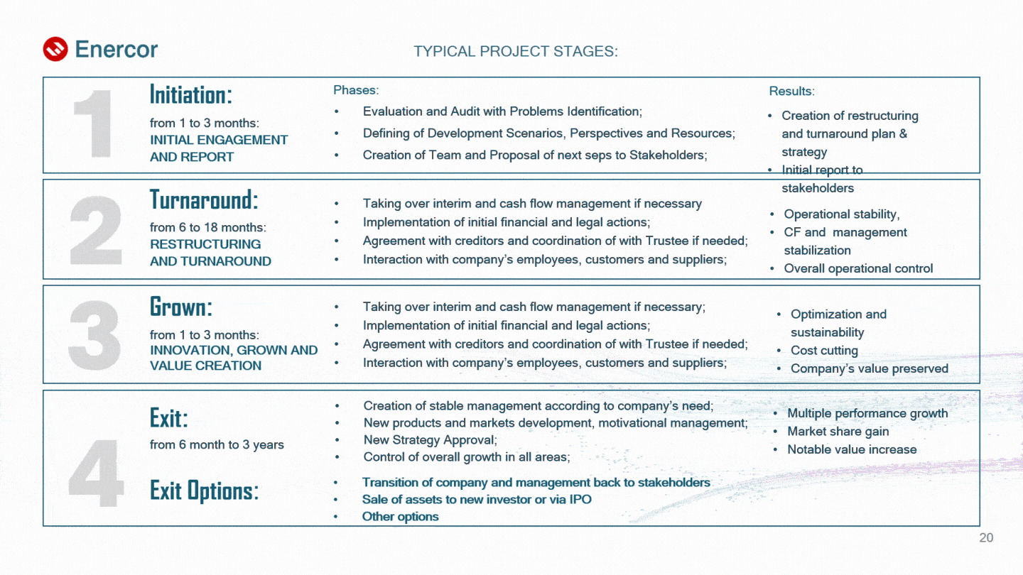
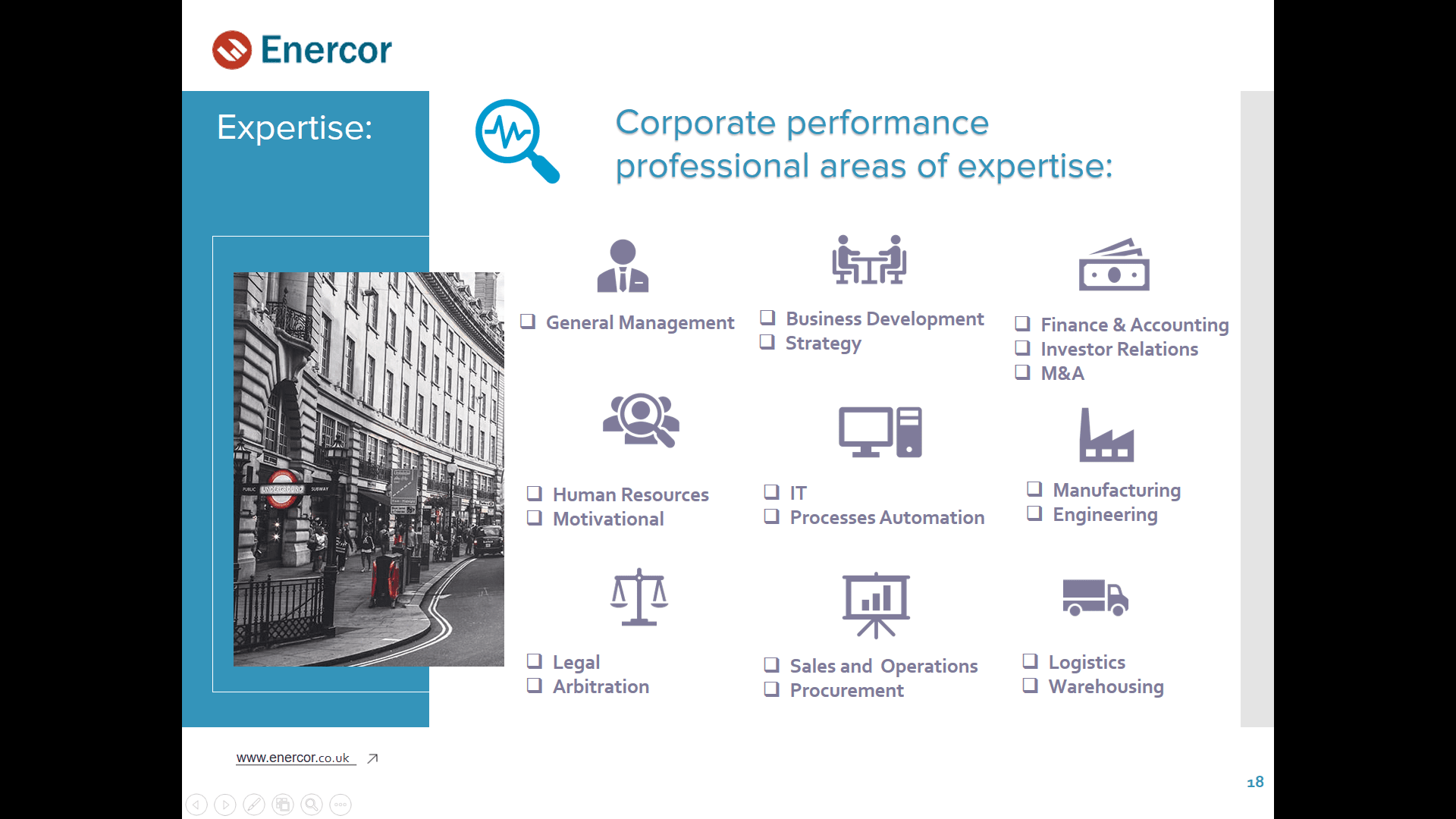
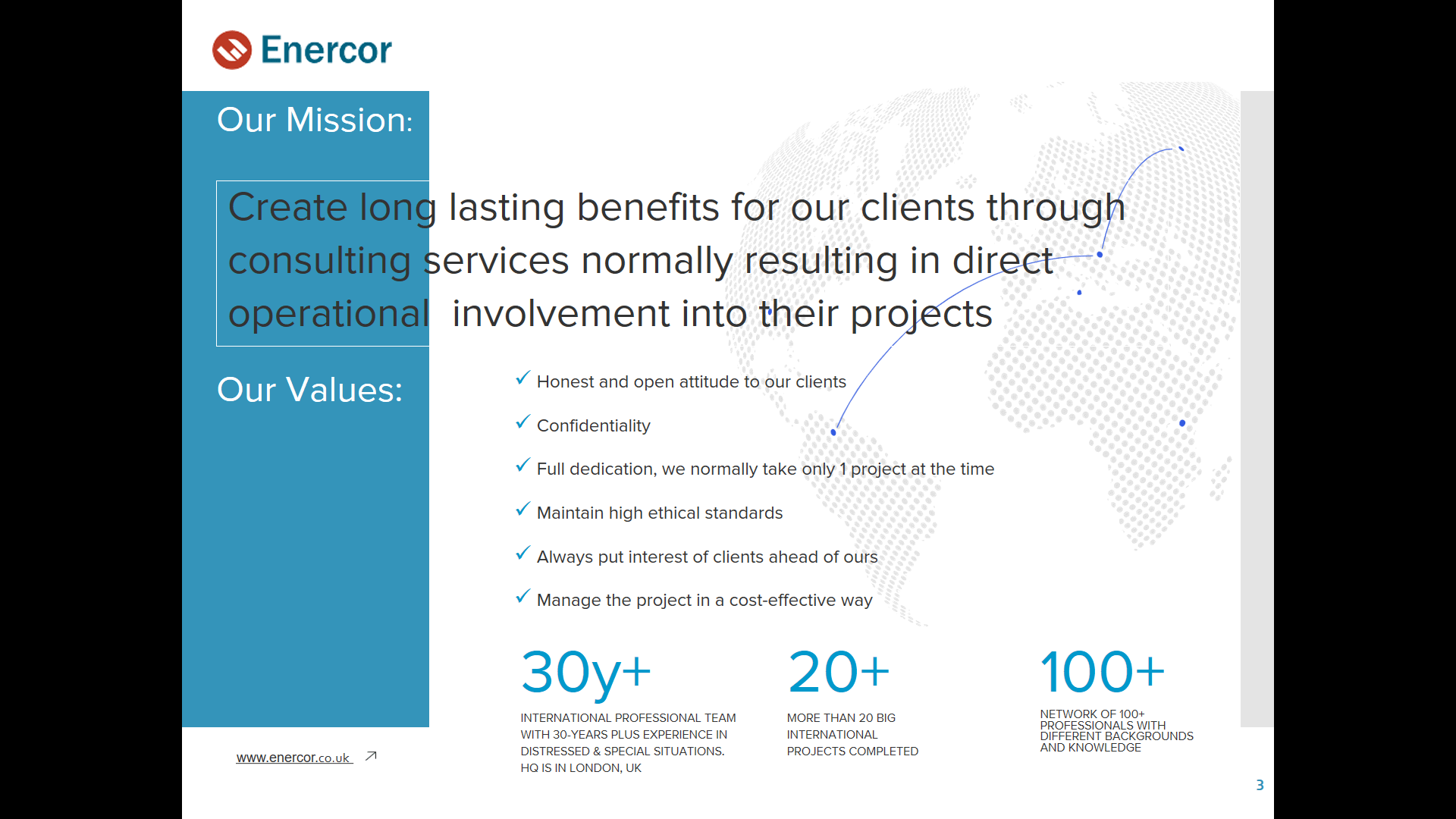
The consulting company Enercor operates on the international market of services for the management and restructuring of inefficient enterprises. Previously, the client cooperated with us in web development, and at the time of the request, he already had his own logo, corporate identity and design layouts of the site. After the completion of the project, the client turned to us again, only this time for the development of a company presentation in Microsoft PowerPoint.
By the way, we have quite a lot of cases when clients return. We don’t want to brag, but they say that it is pleasant and efficient to work with us.
The objective
So, following the new web design, Enercor decided to update the presentation about the company in order to refresh the look of the slides in accordance with the style of the site. A redesign is a good idea, because over time the appearance of digital products becomes outdated and needs to be updated, based on modern visual trends.
What we have
The client provided us with an old version of the presentation that needed a complete design upgrade. The content and structure of the text did not require any special changes, so the services of our copywriters were not needed:

What was required of us:
- to create a modern business presentation in a minimalistic European style;
- to maintain the corporate identity of the company, in particular, the style of the site;
- to save the text content and structure of the presentation;
- to use only light background for slides;
- to make a presentation in Power Point due to the wide possibilities of the program for animation and content editing on the client side.
Presentation development and design
The principle of content placement
All blocks on the slides are placed according to the principle of visual hierarchy: information blocks are logically grouped and connected in meaning, which makes it possible to distinguish between the important and the unimportant. We tried to organize all the content in such a way that it would be most convenient for the listeners of the presentation to perceive the information. And so that the presentation does not look boring, almost all slides are visually different from each other.
Before:

After:
Some points on the placement of content were additionally agreed with the client. So, one of the wishes of the customer was to place a logo in the header of the slides, and opposite it, where possible, an active link to the company's website:

Fonts
For the presentation, we used the same font as on the company's website: Plain is simple, versatile and quite flexible, as it has 12 styles and their corresponding italics.
Short and apt headlines are in large capital letters in the signature gentian blue color. The quotes are in italics, and the main text of the presentation is a moderately wide and saturated font, which will not allow the text to get lost or blurred when demonstrating slides on the projector screen:

Icons and illustrations
To save time and reduce design costs, some of the icons were taken from the corporate site or stock sites. However, we drew most of the graphic elements ourselves in the Adobe Illustrator vector graphics editor. Let's see what came of it.
Before:
After:

Background illustrations in the form of abstract elements similar to neural networks were part of the company's corporate style, so we had to correctly arrange them according to all the principles of composition:

Infographics
This is one of the most effective ways to visualize dry and complex information. Structured data in the form of infographics is perceived 30 times better than plain text. That is why we paid special attention to it and thought through all the details: the semantic placement of elements based on the convenience of perception, the consistency of the style and structure of the presentation, as well as the selection of suitable animation effects.
Before:
After:

Before:

After:
Images
At the request of the client, most of the images were taken from the Enercor website. In cases where there was a shortage of visual content, we turned to stock services and selected suitable photo options with a license to use.
In working with images, we used the Adobe Photoshop raster graphics editor, in particular, to remove unnecessary details and color correct portrait photographs.
Before:

After:
Animation
To bring a formal business presentation to life, we applied smooth animation effects, following the example of a company website. The difference is that the animation on the site is triggered when the cursor is hovered over an interface element, while in the presentation, the effects are applied to images and text and are played when the slide transitions.
The choice of animation was based on the existing effects of the corporate website in order to emphasize the unity of the brand in the digital (and not only) environment. As we already mentioned, there are no identical slides in the presentation, with the exception of those that carry the same semantic load. But at the same time, all 28 slides of the presentation are permeated by the unity of not only elements similar in style (for example, icons + description, headings + dice, etc.), but also similar animation effects: appearance, rise, movement, etc. As a result, the smooth movement of objects inspires a sense of calmness to the listeners of the presentation, and the competent setting of the direction of this movement (from left to right, top to bottom) creates a convenience for the perception of the presentation:

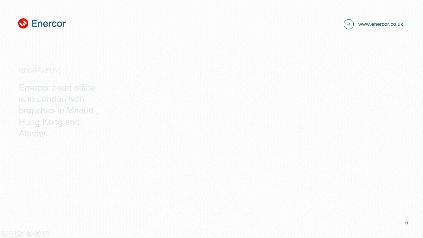
Slides also have a certain sequence of animations, implemented by adjusting the speed and duration of this or that effect. And on some slides, the animation gives a response to the user's action. So, on the slide showing the company's branches, you can see the gradual appearance of points on the map, as well as the flickering of the name of the country where it appears:
Summary
Consulting company Enercor can rightfully be called our regular client, because we managed to develop for them not only a stylish and functional website, but also a business presentation of a similar style that meets all the requirements of modern design and specific marketing tasks of the company. All slides of the presentation are designed in the corporate style, and the entire array of complex information is presented in a convenient format in the form of dynamic infographics. Smooth animation not only maintains interest, but also focuses the attention of listeners on the most important.
[post_title] => Presentation Redesign for a Consulting Company [post_excerpt] => [post_status] => publish [comment_status] => open [ping_status] => closed [post_password] => [post_name] => presentation-redesign-for-a-consulting-company [to_ping] => [pinged] => [post_modified] => 2023-09-13 17:28:05 [post_modified_gmt] => 2023-09-13 14:28:05 [post_content_filtered] => [post_parent] => 0 [guid] => https://wnauts.com/?post_type=project&p=16488 [menu_order] => 0 [post_type] => project [post_mime_type] => [comment_count] => 0 [filter] => raw ) )Worked on
-

SEO Case Study: Digital Agency Website Promotion
-
Team:
6
-
Cases:
0
-
Reviews:
0
-
-

SEO & Search Promotion for Fishing Brand
-
Team:
3
-
Cases:
0
-
Reviews:
0
-
-

E-Commerce SEO Promotion in Ukraine
-
Team:
6
-
Cases:
0
-
Reviews:
0
-
-
Dental Clinic Website Development
-
Team:
7
-
Cases:
0
-
Reviews:
0
-
-
Custom Software Platform Developed for a Company Based in Ukraine
-
Team:
6
-
Cases:
0
-
Reviews:
0
-
-
Website for Renting Luxury Real Estate in the UAE
-
Team:
4
-
Cases:
0
-
Reviews:
0
-
-

Presentation Redesign for a Consulting Company
-
Team:
4
-
Cases:
0
-
Reviews:
0
-


