


Anastasiia Khaienko
Graphic designer
Stack
-

Adobe Photoshop
-

Adobe Illustrator
-

Figma

- to create a modern business presentation in a minimalistic European style;
- to maintain the corporate identity of the company, in particular, the style of the site;
- to save the text content and structure of the presentation;
- to use only light background for slides;
- to make a presentation in Power Point due to the wide possibilities of the program for animation and content editing on the client side.
Presentation development and design
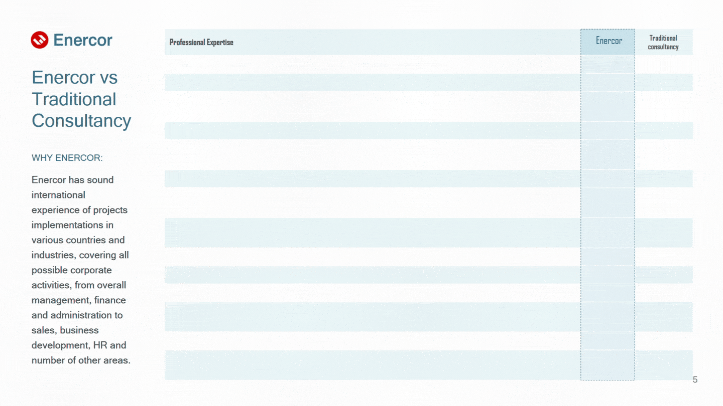
The principle of content placement
All blocks on the slides are placed according to the principle of visual hierarchy: information blocks are logically grouped and connected in meaning, which makes it possible to distinguish between the important and the unimportant. We tried to organize all the content in such a way that it would be most convenient for the listeners of the presentation to perceive the information. And so that the presentation does not look boring, almost all slides are visually different from each other.
Before:

After:
Some points on the placement of content were additionally agreed with the client. So, one of the wishes of the customer was to place a logo in the header of the slides, and opposite it, where possible, an active link to the company's website:

Fonts
For the presentation, we used the same font as on the company's website: Plain is simple, versatile and quite flexible, as it has 12 styles and their corresponding italics.
Short and apt headlines are in large capital letters in the signature gentian blue color. The quotes are in italics, and the main text of the presentation is a moderately wide and saturated font, which will not allow the text to get lost or blurred when demonstrating slides on the projector screen:

Icons and illustrations
To save time and reduce design costs, some of the icons were taken from the corporate site or stock sites. However, we drew most of the graphic elements ourselves in the Adobe Illustrator vector graphics editor. Let's see what came of it.
Before:
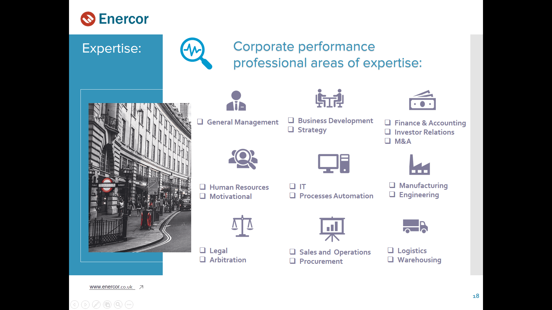
After:

Background illustrations in the form of abstract elements similar to neural networks were part of the company's corporate style, so we had to correctly arrange them according to all the principles of composition:

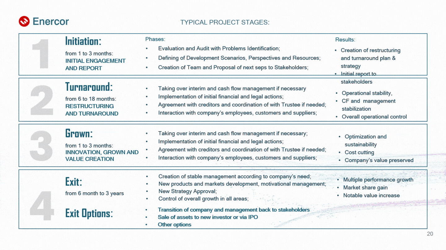
Infographics
This is one of the most effective ways to visualize dry and complex information. Structured data in the form of infographics is perceived 30 times better than plain text. That is why we paid special attention to it and thought through all the details: the semantic placement of elements based on the convenience of perception, the consistency of the style and structure of the presentation, as well as the selection of suitable animation effects.
Before:
After:

Before:

After:
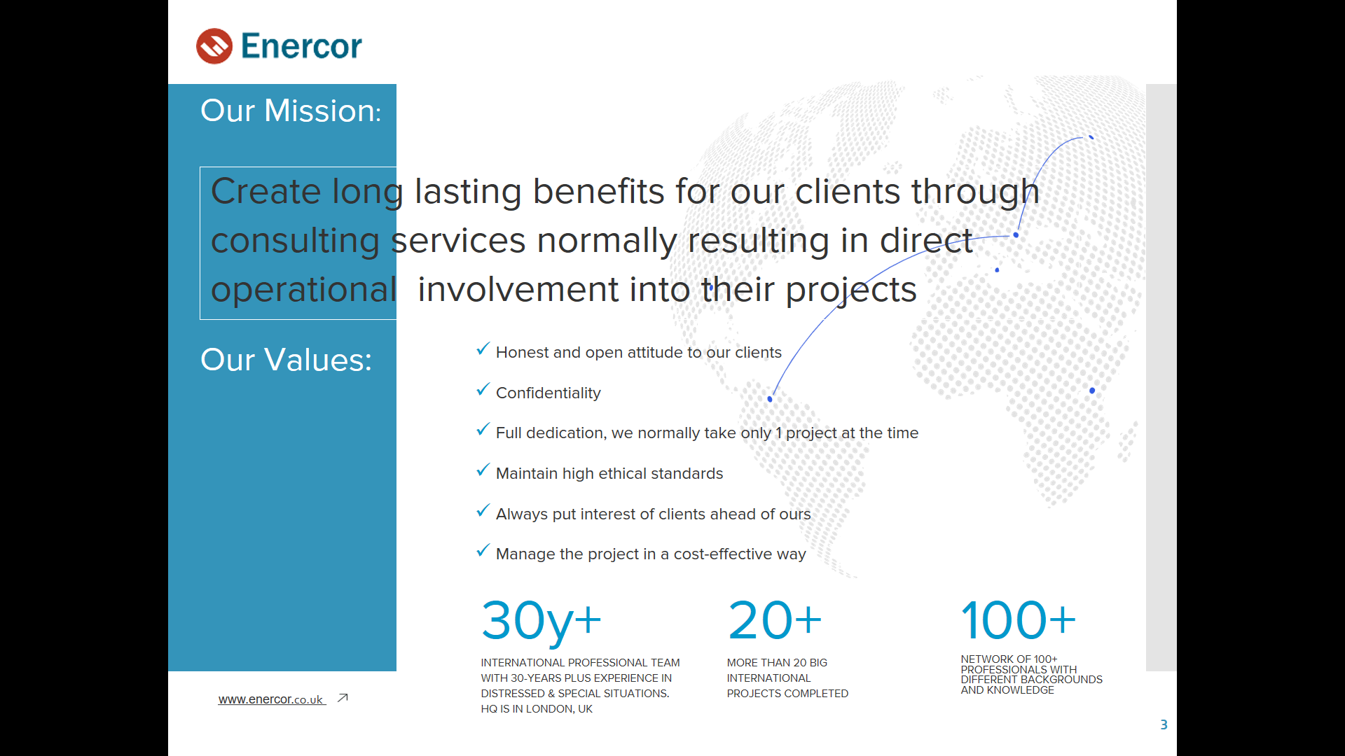
Images
At the request of the client, most of the images were taken from the Enercor website. In cases where there was a shortage of visual content, we turned to stock services and selected suitable photo options with a license to use.
In working with images, we used the Adobe Photoshop raster graphics editor, in particular, to remove unnecessary details and color correct portrait photographs.
Before:

After:

Animation
To bring a formal business presentation to life, we applied smooth animation effects, following the example of a company website. The difference is that the animation on the site is triggered when the cursor is hovered over an interface element, while in the presentation, the effects are applied to images and text and are played when the slide transitions.
The choice of animation was based on the existing effects of the corporate website in order to emphasize the unity of the brand in the digital (and not only) environment. As we already mentioned, there are no identical slides in the presentation, with the exception of those that carry the same semantic load. But at the same time, all 28 slides of the presentation are permeated by the unity of not only elements similar in style (for example, icons + description, headings + dice, etc.), but also similar animation effects: appearance, rise, movement, etc. As a result, the smooth movement of objects inspires a sense of calmness to the listeners of the presentation, and the competent setting of the direction of this movement (from left to right, top to bottom) creates a convenience for the perception of the presentation:

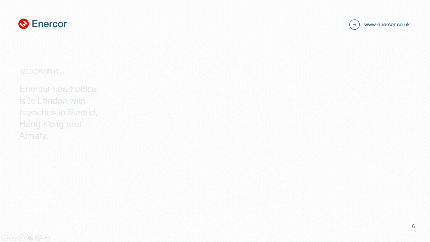
Slides also have a certain sequence of animations, implemented by adjusting the speed and duration of this or that effect. And on some slides, the animation gives a response to the user's action. So, on the slide showing the company's branches, you can see the gradual appearance of points on the map, as well as the flickering of the name of the country where it appears:
Summary
Consulting company Enercor can rightfully be called our regular client, because we managed to develop for them not only a stylish and functional website, but also a business presentation of a similar style that meets all the requirements of modern design and specific marketing tasks of the company. All slides of the presentation are designed in the corporate style, and the entire array of complex information is presented in a convenient format in the form of dynamic infographics. Smooth animation not only maintains interest, but also focuses the attention of listeners on the most important.
[post_title] => Presentation Redesign for a Consulting Company [post_excerpt] => [post_status] => publish [comment_status] => open [ping_status] => closed [post_password] => [post_name] => presentation-redesign-for-a-consulting-company [to_ping] => [pinged] => [post_modified] => 2023-09-13 17:28:05 [post_modified_gmt] => 2023-09-13 14:28:05 [post_content_filtered] => [post_parent] => 0 [guid] => https://wnauts.com/?post_type=project&p=16488 [menu_order] => 0 [post_type] => project [post_mime_type] => [comment_count] => 0 [filter] => raw ) [1] => WP_Post Object ( [ID] => 19164 [post_author] => 14 [post_date] => 2023-02-02 14:23:28 [post_date_gmt] => 2023-02-02 11:23:28 [post_content] =>- About the project and task
- Analysis and strategy
- Corporate style
- Profile packaging
- Content plan and tone of voice
- Setting up advertising tools
- Summary
About the project and task
Customer: Krivyi Rig company Ideal Energy, which sells, installs and maintains solar power plants (SPP), as well as solar panels of various formats. At the time of contacting Webnauts, our customer was not represented on the Internet. However, not having a website is not a reason for not making yourself known. Social networks do an excellent job with this task, and our SMM super team makes it happen.
Promotion goal: to create an online brand from scratch and get the first applications.
Platforms: Instagram and Facebook.
Geography: Dnipropetrovsk and Kirovograd regions, Ukraine.
Duration of cooperation: 2 months.
Analysis and strategy
Before you can build a successful solar/panel social media (SMM) strategy, you need to research your competitors. Based on analytical services and our own observations, we found out what kind of content users want. And then we analyzed the users themselves in order to accurately determine the tone of voice — the style of future communication.
So, our target audience is women and men aged 27-55 with an average income who can afford the installation of solar power plants at home, and businessmen who want to provide their business with uninterrupted and cheap electricity.
Based on a detailed analysis, we have built a clear task plan to achieve the main goal - to launch a business in social networks and attract the first customers.

Corporate style
Webnauts designers have developed a corporate style: logo, fonts and colors. This is the minimum that allows a small business to move into the category of a recognizable brand.


Designers have developed a unified style and options for generating a grid of publications, as well as prepared templates and graphic elements for individual headings:


Profile packaging
While branded layouts were being developed, the SMM specialist was busy with the packaging of profiles:
- designed the page header on Instagram and filled in the basic information about the company on Facebook,
- introduced a branded hashtag #idealenergy_ua and selected relevant hashtags for organic page promotion.
When the layouts were ready, the SMM manager updated the avatars, installed the covers, and designed the actual stories according to the corporate style:


Content plan and tone of voice
Competitive analysis helped determine suitable topics and develop a content plan for posts and stories by category. We alternated acquaintance with services and products, answers to frequently asked questions and customer reviews with useful and interesting information (news, life hacks, facts and quotes).
All posts and stories are designed in a single visual style and match the tone of voice. Thus, a friendly and at the same time businesslike and discreet style of communication is reflected in soothing colors, serious Gothic fonts and high-quality images, which emphasize the innovative spirit of the company:

The formal and respectful tone of the brand can also be seen in the texts: descriptions, publications, stories, comments and private messages. So, we politely address readers, use special terms (the key one is solar power plant) and call for the generation of clean electricity.

Setting up advertising tools
When the profile is properly packaged and filled with visually appealing and useful content, all that is left to do is to set up advertising tools. This is a rather important stage before launching targeted advertising, which requires a clear algorithm of actions:
- creating a Meta Business Manager account,
- creating an advertising account with a link to a bank card,
- changing your Instagram account to professional and connecting it to Meta Business Manager.
When all the tools are set up and accounts are combined into one business system, you can open Ads Manager and create advertising campaigns.
Launch of targeted advertising
Our collaboration with Ideal Energy involved launching one social media campaign for solar panel / power plant sales that would show the client the possibilities of paid promotion on Instagram and Facebook. Designers worked on the creatives for the campaign, everything else is the work of an SMM specialist, namely writing advertising texts and technical settings:


Target action: send a message
Destination: Instagram Direct and Facebook Messenger
Audience: men and women aged 30-47 living in Dnepropetrovsk and Kirovograd regions
TA Interests: energy efficiency, power industry, energy, SunPower, alternative energy, power distribution, power generation, renewable energy, solar battery, solar power system, solar power, solar power plant, power transmission, electricity, power grid, real estate, agriculture household, farm, home, home improvement, building materials, major repairs, heating, engineering, small and medium businesses
Ads format: universal posts with CTA button
Number of ads: 6 (3 for each platform)
Show duration: 11 days
Budget: $21
Result: 20 messages

Summary
It took us only 2 months to create an online brand from scratch, get the first requests and thus prove the effectiveness of SMM in promoting the business of selling and installing solar panels and power plants. We paved the way for self-promotion of the company on Instagram and Facebook: we thought out a strategy, developed a corporate style, packaged pages, set up advertising tools and ran an effective advertising campaign. Through organic promotion, we gained 160 subscribers, and the targeting efficiency was 20 applications with a minimum budget of $21 (or $1.05 per lead).

Worked on
-

Presentation Redesign for a Consulting Company
-
Team:
4
-
Cases:
0
-
Reviews:
0
-
-
SMM and Branding for a Company Selling and Installing Solar Power Plants
-
Team:
3
-
Cases:
0
-
Reviews:
0
-
