


If you want code to be easy and fast to write, make it easy to read.
©Robert C. Martin
Evhenii is a real webnaut and a born programmer. Since school, he has been interested in mobile and computer applications, analyzing their structure and stages of creation.
One of the few who was offered a job at Webnauts after completing a development course. Despite being constantly busy, he successfully combines the difficult position of a programmer in a large company and studying at the Kyiv National University with a degree in software engineering.
Evgeniy has managed to work on:
webnauts.academy — layout, introduction of visual elements, adding animations and creating course pages. Used HTML, CSS, SCSS and JavaScript in his work.
rusonyx — redesign and layout of pages, introduction of visual elements, animations; adding and developing service pages. Used HTML, CSS, SCSS and JavaScript in his work.
roboarchive — redesign and layout of pages, the introduction of visual elements. Used HTML, CSS, SCSS and JavaScript in his work.
Stack
-

CSS
-

HTML 5
-

JavaScript
-

Vue.js
-

Nuxt.js
- delivering humanitarian aid to Kharkiv;
- distributing and delivering food to people living in houses and bomb shelters;
- delivering people in need of medical care to doctors or to the main railway station for evacuation;
- preparing and distributing prepared food to the soldiers of the Armed Forces of Ukraine, as well as providing two military offices with food.
At the time of contacting us, volunteers were in dire need of financial support. Our team offered a quick and optimal solution — the development of a landing page for collecting donations for volunteers in Ukraine.

The objective
Volunteers needed a small and user-friendly website, the main purpose of which is to raise funds for the needs of Kharkiv residents and the military. To do this, we needed to tell about the existence of the volunteer organization itself, about the work they carry out, and to ensure integration with payment systems. Thus, everyone who has the opportunity to financially support the organization could quickly and easily transfer funds in any currency, including various types of cryptocurrencies, to the accounts of the organization's members.
Implementation
Our team did not hesitate to respond to Natalia's request and set to work on the project with great enthusiasm. In the shortest possible time, a one-page site was made using CSS/HTML/JS and PHP, with a design that fully complied with the pre-rendered layout. And also made it adaptive for all kinds of mobile devices.
A one-page website = landing page. This format for sites where there is no branched structure is quite popular today. All information is on one page, and the user views it within one session.
The choice of a one-page site was due to the fact that this type of site allows you to concisely present important information and focus on the most important. In our case, it is donations.
Design creation
Since the theme of the site is related to the war and its consequences, we did not make a sophisticated design,which would waste time on complexities and frills. Taking into account the wishes of the customer, we tried to make the site uncluttered, understandable and easy to use. Therefore, when developing the design, we preferred a simple and light style. The colors of the site were chosen with a certain symbolism:
- white — associated with the kindness of selfless volunteers,
- blue and yellow — the colors of the Ukrainian flag - as a symbol that help is intended for the people of Ukraine,
- and the fact that the site itself turned out to be light and transparent indicates the same intentions of the organization's members and that the assistance provided will be available to everyone who needs it so much.
The entire one-pager can be divided into seven small blocks:
- «The volunteer team of Vadim Melikhov» — a brief description of what the team does,
- «What We Do» — a more detailed account of the types of assistance provided by volunteers,
- «Support volunteers» by making a donation — the main target block with buttons for payment systems for financial assistance,
- «Gallery» — drawn and implemented with a full photo and video report on the work of the team,
- «Tactical equipment» is a kind of message from fellow volunteers from the United States with a call to collect help for the Ukrainian military,
- «Help for Refugee Families» — with an appeal to "Contact Us" to provide assistance to refugee families from Kharkiv,
- «Team of Volunteers» is a photo gallery of selfless and fearless members of Vadim Melikhov's team.
Development
Our developers wrote the server part of the site using the PHP programming language.
PHP is an open source general purpose C-like scripting language. It is used to create dynamic web resources and is supported by almost all hosting providers. PHP code can be embedded directly into HTML and has a wide range of features and a large set of built-in tools for developing web applications.
Using a simple code editor and a standardized HTML document markup language, our developers filled out the template by structuring the content on the page. And, using the CSS markup language used for the visual design of the resource, we formatted the content of the site, making it attractive to users. We also used the Gulp project collector.
Gulp is a task manager written in the JavaScript programming language that automates commonly used tasks in web development, thereby helping to speed up the development process.
With the help of this program, we were able to quickly organize and turn a set of individual files into a one-page site, logically structured and built in sections.
Multilingualism
Since the site was originally designed for Ukrainian and Western audiences, we made it bilingual — the user can read all the necessary information in Ukrainian or English. In this case, we implemented multilingualism by creating two pages in different languages within our site. The required language can be selected using the switch at the top of the web resource, next to the menu.

Adding donation forms
The main block of the project is located almost in the center of the one-pager.
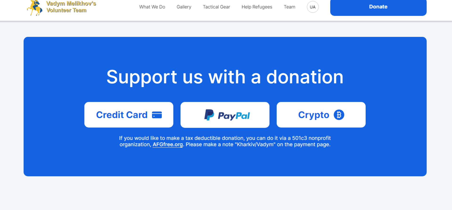
Large white buttons are placed on a blue background, indicating various types of payment services and links to forms so that donations can be made in any currency and in convenient ways:
- Credit Card — payment by credit card,
- PayPal is the largest debit electronic payment system, providing contactless payments in twenty-five types of currencies,
- Crypto — payment with cryptocurrency. Here, depending on the type of currency, you can copy the number of a suitable e-wallet in order to make transfers.
Summary
As a result of the work done, in a fairly short time we drew and laid out a bilingual one-page website (landing) to collect donations to recipients in Ukraine. By connecting payment systems to it, we quickly implemented the task set by the customer-volunteer. This functionality has already shown its effectiveness and perfectly coped with the assigned mission: the first donations didn’t take long to come. Thanks to each and everyone who believes in Ukraine and supports in any way they can at this terrible time for our country.
[post_title] => Landing Page for Collecting Donations [post_excerpt] => [post_status] => publish [comment_status] => open [ping_status] => closed [post_password] => [post_name] => development-of-a-landing-page-for-collecting-donations [to_ping] => [pinged] => [post_modified] => 2023-09-18 10:24:19 [post_modified_gmt] => 2023-09-18 07:24:19 [post_content_filtered] => [post_parent] => 0 [guid] => https://wnauts.com/?post_type=project&p=14210 [menu_order] => 0 [post_type] => project [post_mime_type] => [comment_count] => 0 [filter] => raw ) [1] => WP_Post Object ( [ID] => 16157 [post_author] => 10 [post_date] => 2022-08-26 14:02:16 [post_date_gmt] => 2022-08-26 11:02:16 [post_content] =>A task
Enercor, an international consulting company specializing in the management and restructuring of inefficient enterprises, approached us with the task of developing a corporate website. At the time of the request, the client already had a desktop website design with infoblocks reflecting:
- mission and benefits,
- the range of services provided,
- team composition and completed projects,
- news, vacancies and company contacts with an application form for consultations.
What we had to do was the development — to breathe life into the project and present a modern, functional and adaptive website to the client. Read about how we did it in our case.

Technological solutions
When developing the site, we used CMS WordPress — one of the most popular platforms. It is good because in the future the client will be able to easily manage the content of the site: add web pages and place text, images and videos even without the help of a developer. WordPress also allows you to scale the site in the future — for example, add a blog or other additional features.
Website coding
Our front-end developer was faced with the task of turning images into code using HTML, CSS (using the SCSS syntax of the Sass preprocessor) and JS. In his work he also used one of the modern coding techniques — Grid. What is it? Grid coding allows you to create responsive pages for any type of device and position elements on the site correctly — text, photo, video, or any other HTML block.

The implementation of modal windows on the Projects page was interesting: when you click on a case, an easy-to-read card with information appears on the screen:

The task of bringing web pages to life with the help of animations was also fascinating. For example, when scrolling the page, the slightest movement of the mouse or touching the touchpad, you can get really carried away with the original effect of the cursor following. The decorative airdrop cursor was implemented using the GSAP JavaScript library, or GreenSock Animation Platform, a popular scripted web animation toolkit:

Front-end development took 170 hours, including edits from the client. To speed up the work and competently prepare the project for release, our front-end developer used the Gulp project assembler, a tool for automating tasks (minification, testing, file merging, etc.), written in the JavaScript programming language.
Website functionality
The development of the server part of the site took 126 hours. In the course of the work, a complex structure of transitions between sections was implemented through many anchor and simple internal links. This means that when clicking on the link, the user goes not only to the desired page, but also to a part of it that is relevant in meaning:

Thus, the Services section reflects the company's activities with links to separate pages, where each service is described in more detail:

On the services page, there is an Expertise block with a list of key areas in which the company specializes. Paragraphs of the same name in the description of the expertise of each team member also lead to this block. In the future, the client plans to link these points also with specific projects of the company.

The Projects section is a catalog of completed projects of the company of 2 types: with brief information presented as a card and with a full description of the case in the form of a separate web page:

The Team section presents all team members with a photo, a short description, expertise and a link to the city. Clicking on one of the cards takes the user to a page with more detailed information, which contains a link to the LinkedIn profile and a list of financial and economic publications where experts have been published:

The Vacancies section contains the company's job offers, as well as a form which enables to send a resume even if there are no vacancies:

The News section of the site displays publications as a gallery, loaded from the company's profile on LinkedIn. The ability to embed this type of content on the site was implemented using the Tagembed social media aggregator:

The Contacts section contains the contact details of the company and a convenient form for contacting a specific representative office:

In order to expand the capabilities of the site, the following popular WordPress plugins were used:
- Yoast SEO is a SEO management tool that helps visitors and search engines get the most out of your site.
- ACF (Advanced Custom Fields) — for full control over edit screens and custom field data.
- CF7 (Contact Form 7) — for managing contact forms on the site and flexible configuration of the content of forms and mail.
- WP Mail SMTP — to fix email deliverability issues via SMTP (Simple Mail Transfer Protocol) - the industry standard for sending emails.
To protect the site from spam, reCAPTCHA v3 technology was used, installed through an extension from the above-mentioned CF7 plugin.
In addition to the catalog of plugins, WordPress has ample opportunities for customization — flexible site customization for client requests: changing the layout, adding various options, etc. So, our backender additionally created:
- custom post types for Team and Projects sections;
- custom taxonomies for the Services section, which in turn is linked to the Projects section, and for the cities block linked to the employees of the Team section.
As a result, the client can independently change the visual elements of the site: the order of menu items, the order of blocks, projects, team members, etc.
By the way, remember our amazing decorative cursor? The client could not decide on its color for a long time, so the developer added a color palette for the cursor to the admin panel. Now the client will be able to manage its appearance independently, without the help of a programmer.
Responsiveness
As we wrote earlier, Enercor came to us with desktop layouts. Therefore, our frontender also took care of the convenience of the visitors of the future site, intelligently adapting layouts for mobile devices. If you visit the site from a smartphone or tablet, then you will see that it will be as convenient to perceive text and visual information as it is from a computer screen.

Presentation of the company
Another task, this time for the design department, was the presentation of Enercor. The visual design is fully consistent with the corporate identity of the company: colors, fonts and corporate symbols are consistent. 28 slides are full of peculiar elements in the form of neural networks, and the entire array of information is conveniently and clearly structured. The business tone of the narrative is softened by unobtrusive animation that will capture and hold the attention of the audience:

Results
The completed Enercor project and our experience in developing a corporate website for consulting services on WordPress proves once again that the web site of an international consulting company can be fun and harmoniously combine serious information with smooth animation and captivating decorative elements. Add to that a structured animated presentation and you have another powerful marketing tool.
[post_title] => Corporate Website of an International Consulting Company [post_excerpt] => [post_status] => publish [comment_status] => open [ping_status] => closed [post_password] => [post_name] => corporate-website-of-an-international-consulting-company [to_ping] => [pinged] => [post_modified] => 2023-09-17 16:01:06 [post_modified_gmt] => 2023-09-17 13:01:06 [post_content_filtered] => [post_parent] => 0 [guid] => https://wnauts.com/?post_type=project&p=16157 [menu_order] => 0 [post_type] => project [post_mime_type] => [comment_count] => 0 [filter] => raw ) [2] => WP_Post Object ( [ID] => 17010 [post_author] => 14 [post_date] => 2022-10-31 17:27:18 [post_date_gmt] => 2022-10-31 14:27:18 [post_content] =>About the project and task
Webnauts Academy is an educational project of our company aimed at training and improving the skills of beginners and novice IT specialists.
Webnauts has long been engaged in internal training of employees, as it feels a constant staff shortage. And an attempt to bring the training center to the outside was successful and showed the unprecedented relevance of IT education among the residents of our industrial city.
Having organized the educational process in many areas and convinced of the usefulness and importance of the project, we decided to create a modern IT course website with a minimalistic interface, clear navigation and adjusted for a large amount of content: training programs, video reviews, teachers and graduate cards.

Design
Visual analysis
Before we started designing layouts, we started visual analysis, highlighting more than 10 exemplary sites in the field of IT education. After evaluating the basic design principles of such projects (grids, shapes, colors, fonts and media), we managed to create our own unique design concept.

Website prototyping
Based on the results of visual analysis, the designers carefully thought out the structure of the IT academy website, namely: what will the main screen look like, what blocks will be used to appeal to users' trust, and how to talk about the benefits of educational products? This stage is the creation of a black and white sketch of the site, in which designers focus on UX (User Experience) as much as possible, that is how the interface will work and whether it will be user-friendly.

As you can see, the work of UI/UX designers is not only a creative, but also an analytical process, during which the user experience is carefully studied. This research allowed us to create an effective digital product that turns views into training applications.
Grid in web design
Even though the site contains a lot of information, it looks neat, intuitive, and visually appealing. This effect is created by the grid - the basics of the basics when creating a prototype of any site. But in our case, this is not just an invisible skeleton of the site, but an integral part of the design, and together with large typography, arrows and other signs, it evokes His Majesty the Swiss style.
We can see how thin gray lines permeate all pages, artfully structuring and separating content. Thus, all text, photos, forms and widgets are neatly inscribed in rectangles with clearly defined borders. Thanks to the block structure, we have created an organized and user-friendly interface:
https://wnauts.com/wp-content/uploads/2022/10/webnauts-academy.-grid-in-web-design-1.mp4-1.mp4Brand colors and hover animation
At the initial design stage, the designers already had a logo in the Bauhaus color style: white, black and muted red for accents.
https://wnauts.com/wp-content/uploads/2022/09/webnauts-academy.-brand-colors-and-logotype.mp4So, the design of the site was made in accordance with the existing corporate colors. We used white as the background color: it gives the interface a sufficient amount of space, and at the same time, contrast for other important elements. These are black buttons and drop-down list icons that change their color to red when hovered over. Headings and text boxes with important information are also highlighted in accent red, completely capturing the user's attention:
https://wnauts.com/wp-content/uploads/2022/10/webnauts-academy-hover-animation.mp4.mp4Layout and navigation
As soon as the design concept is ready, the project moves on to the next stage — the actual development of the educational courses website. The front-ender starts first: he codes layouts using HTML, JS, and CSS (SCSS/Sass) languages, and sets the site in motion by animating widgets using GSAP (GreenSock Animation Platform) technology. Let's break down the site and see what we got.
Website first screen
The first screen forms the user's first impression. It is important to remember that it only takes a few seconds to form it, but at the same time, you should not overload the main section with content. Based on these considerations, we placed the most important on the first screen:
- a large and understandable title that fully reflects the theme of the site;
- a horizontal version of the logo with a concise menu in the header;
- a dynamic video telling the user about the main advantage and location of the training center: «Study at the best IT company in Krivoy Rog»;
- a banner with a current offer and a button «All promotions of the academy»;
- main conversion button «Choose a course»:
Block «About us»
It plays an important role in building customer loyalty and trust. But this does not mean at all that it should take up a lot of space or even a separate page. We did without a lot of text full of victories, and limited ourselves to a photograph and really important information that fit in just a couple of sentences:
We are sure that users will appreciate the saving of their precious time, and in the meantime we will try to strengthen their confidence in the reliability of the company with the help of other important blocks and pages.

Educational Products
The main product of the company is a course, and there are no less than 17 of them. We have combined them into 7 categories for individual IT areas and presented them in the form of a drop-down list.
Each course leads to a separate page and introduces more detailed information:
- title, brief content and the beginning of classes with the «Register» button,
- photo gallery showing the educational process,
- the benefits of learning with the button «Full course program»,
- information about the teacher with a photo,
- learning conditions,
- application form with conversion button.
The page is easy to navigate, and all the important and necessary information is at a glance:
https://wnauts.com/wp-content/uploads/2022/10/webnauts-academy-educational-services.mp4.mp4It is worth noting that thanks to the use of the grid, not only the design has become more beautiful, but also the code, in the literal sense of the word. And translated from the language of developers, beautiful means working, structured and readable.
Communication methods
We thought of many different options for the user to contact the company, and even dedicated a separate screen of the main page to this. The goal is obvious to absolutely everyone, but what a presentation! The section captivates with an original individual approach. So, introverts are invited to write, extroverts — to call, and those who doubt — to attend any class of their choice for free:

Company advantages
This section reinforces the «About us» block of the site and is a concise list of 4 points, neatly placed in a table:

Reviews
Video reviews of graduates, or to be more precise, of employed graduates, reinforces the previous text block and inspires even more user confidence. The media section is designed as a circular gallery with black and white photos, numbering and arrows. When you hover over the photo, the photo comes to life, and when you click on it, the full video from Youtube is played.
This block was one of the most interesting and challenging in terms of development, and the result met our expectations. Here is an example of how a fairly minimalistic interface can create a truly unique user experience:
https://wnauts.com/wp-content/uploads/2022/10/webnauts-academy.-block-reviews.mp4.mp4Catalog of graduates
This is another advantage of the company, embodied in a separate landing page. It is dedicated to graduates who have successfully completed their studies and are ready to start new IT projects. The page is a catalog with cards of young professionals. In turn, the card contains a photo of the graduate, brief information and a link to the portfolio, contacts for communication and a button with a resume. The page also has a simple navigation in the form of a horizontal list of 3 lines and allows you to filter candidates by specialization:
https://wnauts.com/wp-content/uploads/2022/10/webnauts-academy.-catalog-of-graduates.mp4.mp4The graduates section can be accessed from the main page block or from the menu item in the site header «About Us — Graduates».
As for the development, we are ready to sing the praises of the grid layout again, because thanks to its horizontal and vertical lines, the coding of the cards was faster, eliminating such a programming phenomenon as «code duplication».
Photo gallery
The importance of photos on the site is difficult to overestimate: real informative photos arouse interest and describe services instead of a thousand words. We designed the photo in the form of a compact ring gallery, which perfectly reflects the educational process in the creative atmosphere of a modern IT company:
https://wnauts.com/wp-content/uploads/2022/10/webnauts-academy.-circular-photo-gallery.mp4.mp4FAQ
The Frequently Asked Questions block is designed to cover common customer objections, thereby reducing the load on managers. In our case, the visitor closes the question of interest, revealing the desired answer. And yes, the drop-down list is still relevant today due to its compactness and ease of use:
https://wnauts.com/wp-content/uploads/2022/10/webnauts-academy.-faq-dropdown-list.mp4.mp4Form and contacts
The application form is as simple as possible and includes only one field for entering a mobile number. A funny large button that changes its color on hover and sends the request for processing adds to the mood.
Users who are used to taking the initiative in their own hands can contact the company at any contact listed in the footer of the site:
https://wnauts.com/wp-content/uploads/2022/10/webnauts-academy.-form-and-contacts.mp4.mp4Responsiveness
In addition to the desktop version of the site, Webnauts designers have worked hard to create layouts for tablets and mobile devices. All blocks and widgets automatically adjust to any screen size, and as a result, the site is convenient to use both on a smartphone and on a desktop computer.

Site functionality
«Not only external, but also internal beauty is important», said the back-end developer and masterfully set up the software-server part of the IT course site on WordPress, in particular:
- custom fields using the ACF plugin (Advanced Custom Fields);
- custom record types Graduates and Courses;
- Ajax forms that allow you to exchange browser data with a web server in the background;
- graduates page with Ajax filters and pagination.
The developer also installed the Loco Translate plugin on the site, which makes it possible to translate all strings wrapped in code, and then converted static strings using the __() function, which can return the original text in the absence of translation or loading of the text domain.
All these complex manipulations made it possible to set up the most convenient and understandable admin panel of the site, in which it is easy to manage the appearance and content of pages without the help of a developer:

The result
The effectiveness of any site is measured by a first-class user experience, and the creation of such a site requires effective interaction between designers and developers. Thanks to the well-coordinated work of the team at every stage — from visual analysis to setting up the system control panel — we managed to implement a convenient and attractive IT course website, both inside and out.
[post_title] => Website for IT courses on WordPress [post_excerpt] => [post_status] => publish [comment_status] => open [ping_status] => closed [post_password] => [post_name] => website-for-it-courses-on-wordpress [to_ping] => [pinged] => [post_modified] => 2023-09-13 17:22:25 [post_modified_gmt] => 2023-09-13 14:22:25 [post_content_filtered] => [post_parent] => 0 [guid] => https://wnauts.com/?post_type=project&p=17010 [menu_order] => 0 [post_type] => project [post_mime_type] => [comment_count] => 0 [filter] => raw ) )Worked on
-
Landing Page for Collecting Donations
-
Team:
3
-
Cases:
0
-
Reviews:
0
-
-
Corporate Website of an International Consulting Company
-
Team:
4
-
Cases:
0
-
Reviews:
0
-
-
Website for IT courses on WordPress
-
Team:
6
-
Cases:
0
-
Reviews:
0
-