


Webnauts Academy
Training center based on Webnauts IT company


- a large and understandable title that fully reflects the theme of the site;
- a horizontal version of the logo with a concise menu in the header;
- a dynamic video telling the user about the main advantage and location of the training center: «Study at the best IT company in Krivoy Rog»;
- a banner with a current offer and a button «All promotions of the academy»;
- main conversion button «Choose a course»:
Block «About us»
It plays an important role in building customer loyalty and trust. But this does not mean at all that it should take up a lot of space or even a separate page. We did without a lot of text full of victories, and limited ourselves to a photograph and really important information that fit in just a couple of sentences:
We are sure that users will appreciate the saving of their precious time, and in the meantime we will try to strengthen their confidence in the reliability of the company with the help of other important blocks and pages.

Educational Products
The main product of the company is a course, and there are no less than 17 of them. We have combined them into 7 categories for individual IT areas and presented them in the form of a drop-down list.
Each course leads to a separate page and introduces more detailed information:
- title, brief content and the beginning of classes with the «Register» button,
- photo gallery showing the educational process,
- the benefits of learning with the button «Full course program»,
- information about the teacher with a photo,
- learning conditions,
- application form with conversion button.
The page is easy to navigate, and all the important and necessary information is at a glance:
https://wnauts.com/wp-content/uploads/2022/10/webnauts-academy-educational-services.mp4.mp4It is worth noting that thanks to the use of the grid, not only the design has become more beautiful, but also the code, in the literal sense of the word. And translated from the language of developers, beautiful means working, structured and readable.
Communication methods
We thought of many different options for the user to contact the company, and even dedicated a separate screen of the main page to this. The goal is obvious to absolutely everyone, but what a presentation! The section captivates with an original individual approach. So, introverts are invited to write, extroverts — to call, and those who doubt — to attend any class of their choice for free:

Company advantages
This section reinforces the «About us» block of the site and is a concise list of 4 points, neatly placed in a table:

Reviews
Video reviews of graduates, or to be more precise, of employed graduates, reinforces the previous text block and inspires even more user confidence. The media section is designed as a circular gallery with black and white photos, numbering and arrows. When you hover over the photo, the photo comes to life, and when you click on it, the full video from Youtube is played.
This block was one of the most interesting and challenging in terms of development, and the result met our expectations. Here is an example of how a fairly minimalistic interface can create a truly unique user experience:
https://wnauts.com/wp-content/uploads/2022/10/webnauts-academy.-block-reviews.mp4.mp4Catalog of graduates
This is another advantage of the company, embodied in a separate landing page. It is dedicated to graduates who have successfully completed their studies and are ready to start new IT projects. The page is a catalog with cards of young professionals. In turn, the card contains a photo of the graduate, brief information and a link to the portfolio, contacts for communication and a button with a resume. The page also has a simple navigation in the form of a horizontal list of 3 lines and allows you to filter candidates by specialization:
https://wnauts.com/wp-content/uploads/2022/10/webnauts-academy.-catalog-of-graduates.mp4.mp4The graduates section can be accessed from the main page block or from the menu item in the site header «About Us — Graduates».
As for the development, we are ready to sing the praises of the grid layout again, because thanks to its horizontal and vertical lines, the coding of the cards was faster, eliminating such a programming phenomenon as «code duplication».
Photo gallery
The importance of photos on the site is difficult to overestimate: real informative photos arouse interest and describe services instead of a thousand words. We designed the photo in the form of a compact ring gallery, which perfectly reflects the educational process in the creative atmosphere of a modern IT company:
https://wnauts.com/wp-content/uploads/2022/10/webnauts-academy.-circular-photo-gallery.mp4.mp4FAQ
The Frequently Asked Questions block is designed to cover common customer objections, thereby reducing the load on managers. In our case, the visitor closes the question of interest, revealing the desired answer. And yes, the drop-down list is still relevant today due to its compactness and ease of use:
https://wnauts.com/wp-content/uploads/2022/10/webnauts-academy.-faq-dropdown-list.mp4.mp4Form and contacts
The application form is as simple as possible and includes only one field for entering a mobile number. A funny large button that changes its color on hover and sends the request for processing adds to the mood.
Users who are used to taking the initiative in their own hands can contact the company at any contact listed in the footer of the site:
https://wnauts.com/wp-content/uploads/2022/10/webnauts-academy.-form-and-contacts.mp4.mp4Responsiveness
In addition to the desktop version of the site, Webnauts designers have worked hard to create layouts for tablets and mobile devices. All blocks and widgets automatically adjust to any screen size, and as a result, the site is convenient to use both on a smartphone and on a desktop computer.

Site functionality
«Not only external, but also internal beauty is important», said the back-end developer and masterfully set up the software-server part of the IT course site on WordPress, in particular:
- custom fields using the ACF plugin (Advanced Custom Fields);
- custom record types Graduates and Courses;
- Ajax forms that allow you to exchange browser data with a web server in the background;
- graduates page with Ajax filters and pagination.
The developer also installed the Loco Translate plugin on the site, which makes it possible to translate all strings wrapped in code, and then converted static strings using the __() function, which can return the original text in the absence of translation or loading of the text domain.
All these complex manipulations made it possible to set up the most convenient and understandable admin panel of the site, in which it is easy to manage the appearance and content of pages without the help of a developer:

The result
The effectiveness of any site is measured by a first-class user experience, and the creation of such a site requires effective interaction between designers and developers. Thanks to the well-coordinated work of the team at every stage — from visual analysis to setting up the system control panel — we managed to implement a convenient and attractive IT course website, both inside and out.
[post_title] => Website for IT courses on WordPress [post_excerpt] => [post_status] => publish [comment_status] => open [ping_status] => closed [post_password] => [post_name] => website-for-it-courses-on-wordpress [to_ping] => [pinged] => [post_modified] => 2023-09-13 17:22:25 [post_modified_gmt] => 2023-09-13 14:22:25 [post_content_filtered] => [post_parent] => 0 [guid] => https://wnauts.com/?post_type=project&p=17010 [menu_order] => 0 [post_type] => project [post_mime_type] => [comment_count] => 0 [filter] => raw ) [1] => WP_Post Object ( [ID] => 18829 [post_author] => 14 [post_date] => 2023-01-12 14:13:25 [post_date_gmt] => 2023-01-12 11:13:25 [post_content] =>- About the project
- The objective
- Front-end development with React
- Student’s personal account
- Teacher's personal account
- Back-end development with Django
- Summary
About the project
Webnauts Academy is our company's educational startup. Here we teach IT professions for beginners and improve the skills of young professionals. And we make the learning process modern, comfortable and enjoyable.
We have already told you about the development of a website and a payment application in the Telegram chat bot. Today it is time for the story about the creation of a personal account for students and teachers of Webnauts Academy.
The objective
Our developers were required to create a platform for convenient and effective communication between a student and a teacher. Thus, we wanted to provide all the conditions for effective learning and maximum realization of the possibilities of the students of the Academy.
To achieve the desired goals, we decided to create a “Student’s personal account” and give it the following functionality:
- student profile,
constant access to lectures and educational materials, - the opportunity to hand over completed assignments to the teacher,
- the ability to track progress and debts,
- communication support not only with the teacher, but also with the administrator of the Academy to clarify organizational issues.
At the same time, we must guarantee confidentiality to each student and ensure sufficient accessibility of the learning platform. And also, on a par with students, to organize the opportunity to work conveniently and productively in the Account for our teachers and the administrator of the Academy.
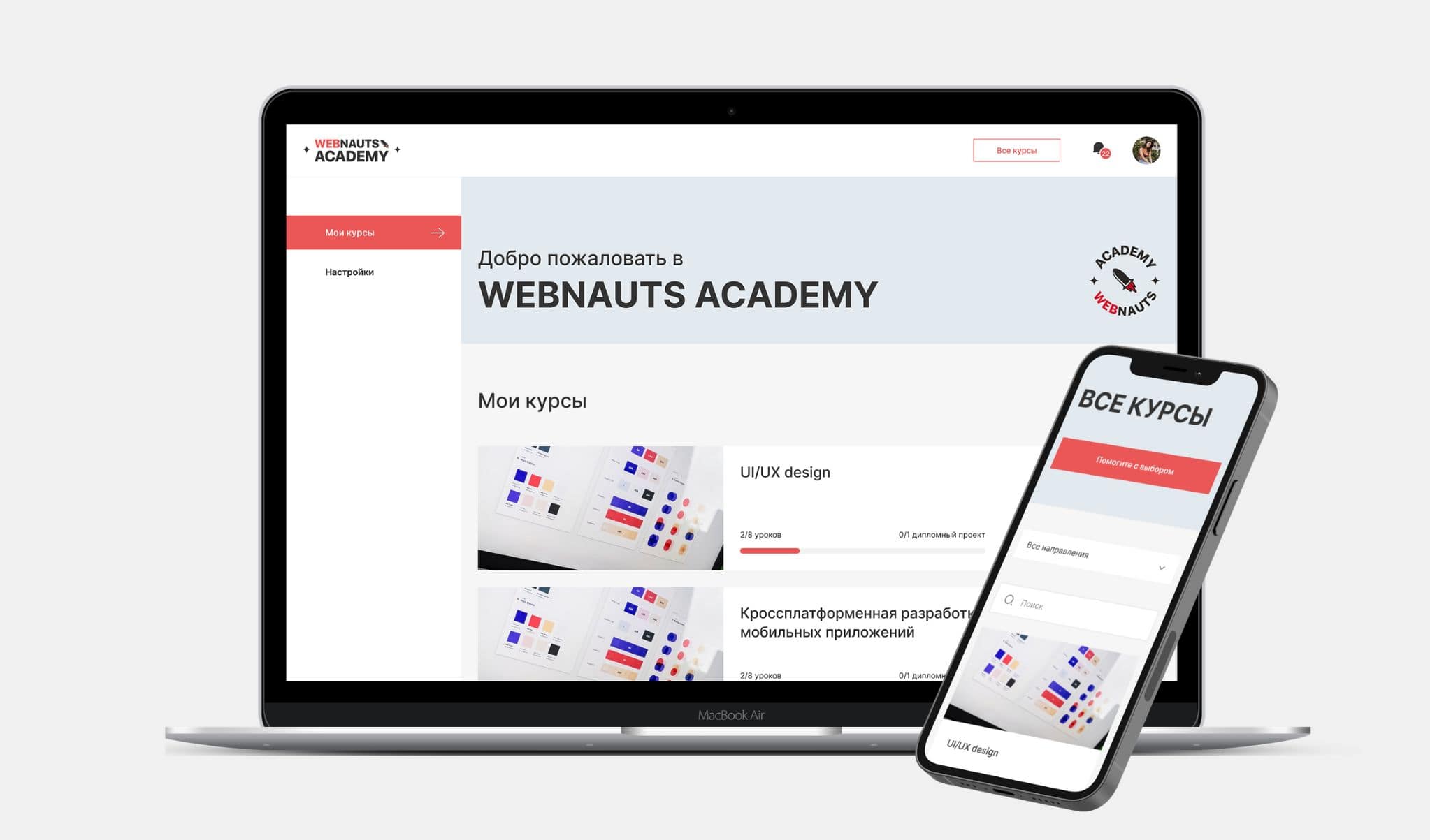
Front-end development with React
1. Creation of a personal account
To create the "Personal Account of the Academy", we needed a platform that could:
- easily maintain all components,
- ensure the speedy work of the account,
- have maximum performance with complex program structures.
That is why we decided to implement the front-end part on React.
React is an open source JavaScript library for building user interfaces. Due to its simplicity, scalability, and high speed, React is often used to develop single-page and mobile applications. The library is backed by Facebook and a large developer community, which means it's very well tested, regularly updated, superbly maintained, and transitions to newer versions as smoothly as possible.
2. Adding authorization and registration
We implemented this function using JSON Web Token (JWT) and provided registration, as well as logging into the user's personal account by entering a login and password.
JSON Web Token (JWT) is an open standard that is designed to transfer data when authenticating a user in client applications, namely where there is a need to enter a username and password to log in. The creation of tokens itself takes place on the server, after which they are signed with a secret key and transferred to the user.
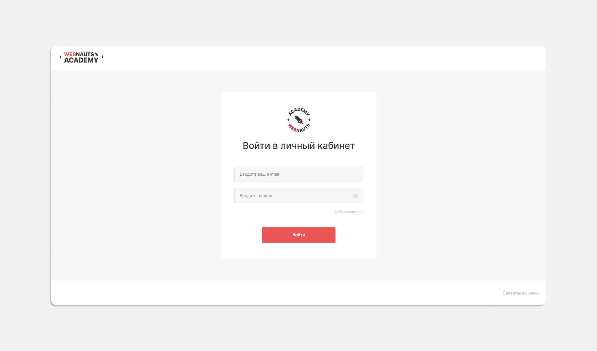
3. Filling the personal account with functionality
In order for the Account to work fully, we used all the features of React, which allowed us to use other libraries. So, the use of React Router v.6 made it possible to implement quick movement between various components of the Account without refreshing the page when the user navigates. And with the Redux library, we built a message passing system. We used it along with a set of specially designed solutions and methods in the optional Redux Toolkit package. This allowed us to significantly simplify the code. A bidirectional communication protocol between the user and the server, WebSocket, was also used, which made it possible for students and teachers to exchange messages in real time.
All these tools in the complex allowed us to implement the following functionality in the context of the “teacher-student” roles:
- give the teacher the opportunity to create lessons,
- implement the function of sending and checking homework,
- add a comment system,
- create an internal personal online chat,
- display the status of homework,
- set up notifications.
Student’s personal account
For clarity, let's take a closer look at what the student's and teacher's personal accounts look like after we have implemented all the desired features.
Working with a personal account
After entering the login and password, the user goes directly to the Account:
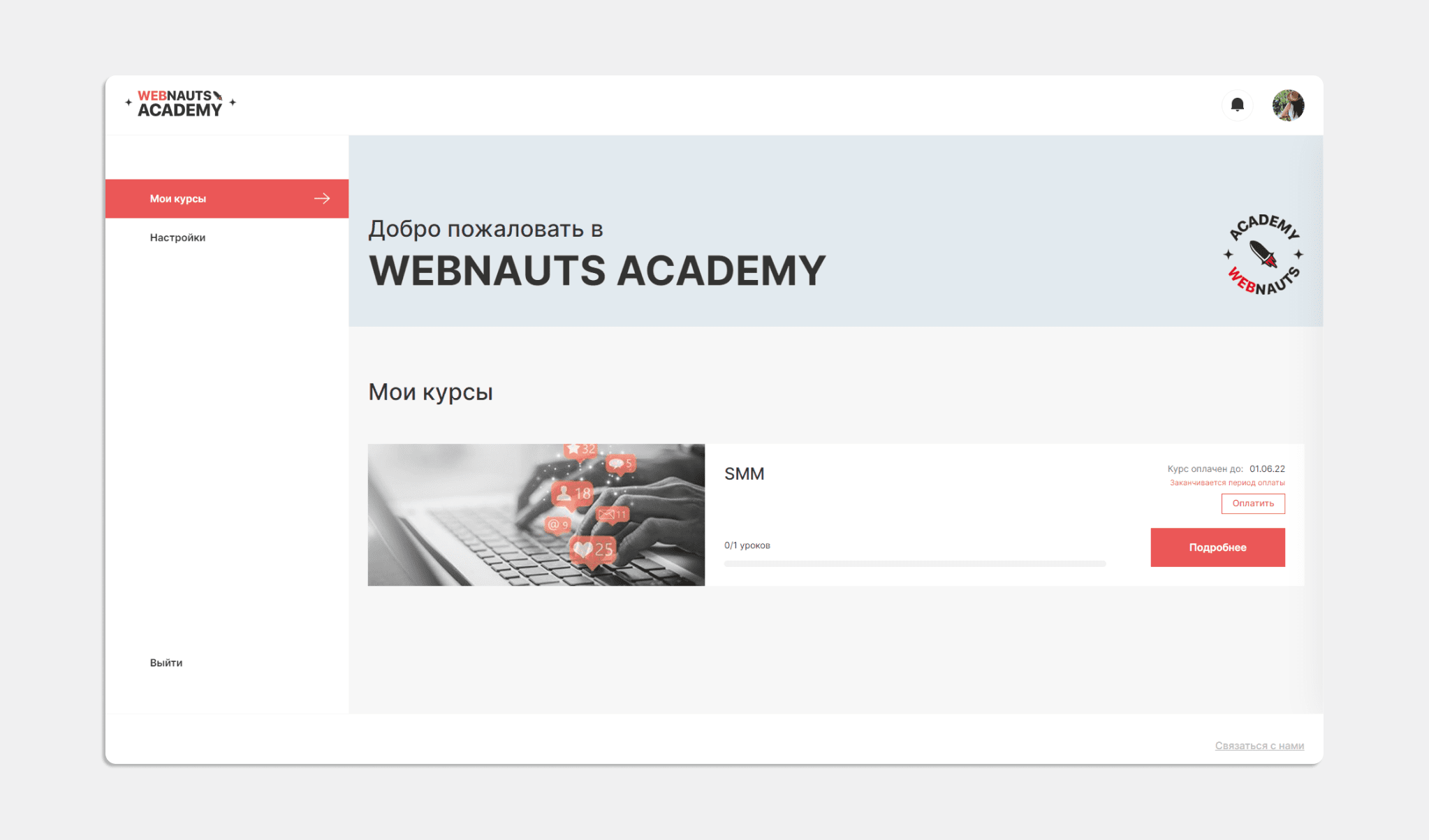
Section "Settings"
When you enter the "Settings" tab, you can fill out a personal profile, attach a photo. And it is here that you can change, if necessary, the login password.
Here, the student independently configures the notifications, and also, if desired, subscribes to the news of the Academy:
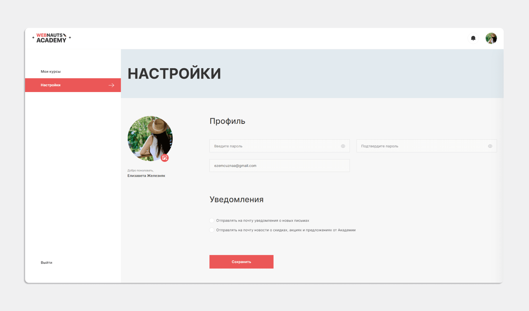
Section "My Courses"
The "My Courses" tab displays the selected course with access to the lessons by clicking the "Details" button:
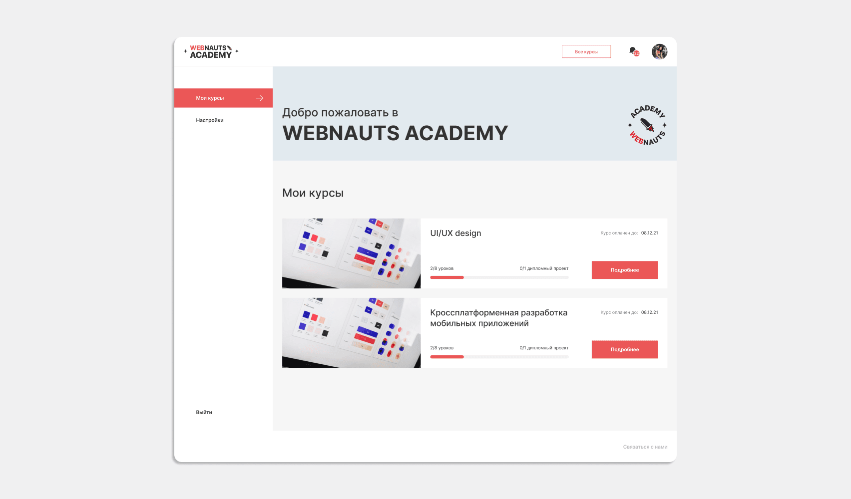
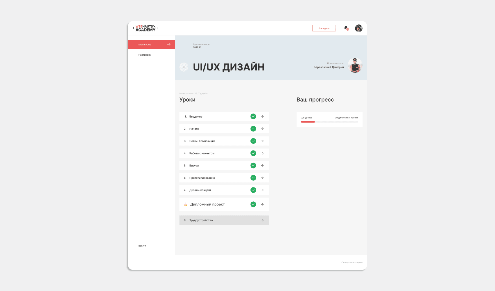
01
/ 02
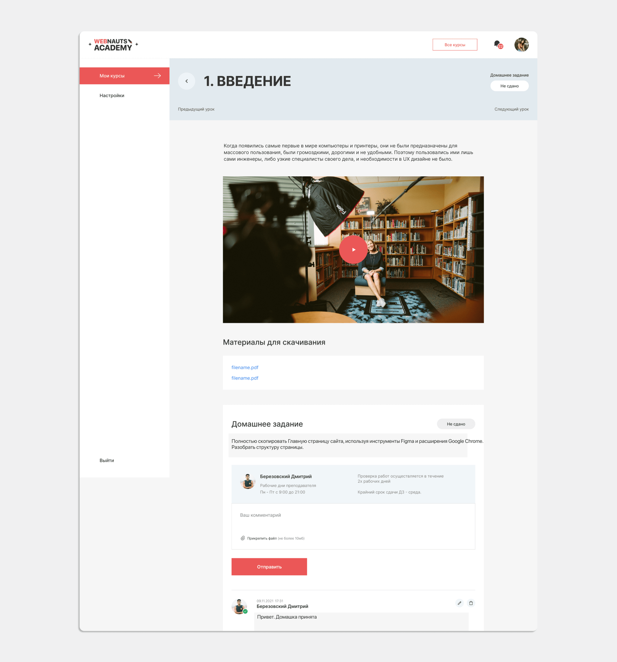
After clicking on the active link of the lesson selected by the user, a block with educational materials appears. This is an overview plan of the lecture, a video lesson and a link to the material for download:
https://wnauts.com/wp-content/uploads/2023/01/academy-students-and-teachers-personal-account-development.mp4Below is the homework that the student is recommended to do in order to work out and consolidate the acquired knowledge and skills. The completed task is attached as a separate file and sent to the teacher for verification:
Teacher's personal account
The teacher's personal account turned out to be no less functional and comfortable than the student's account.
Login to the personal account is carried out only after entering the login and password.
From the inside, the Teacher's Personal Account is very similar to the student's account: it has two similar sections "Settings" and "My Courses". It differs by the presence of an additional section "Statistics".
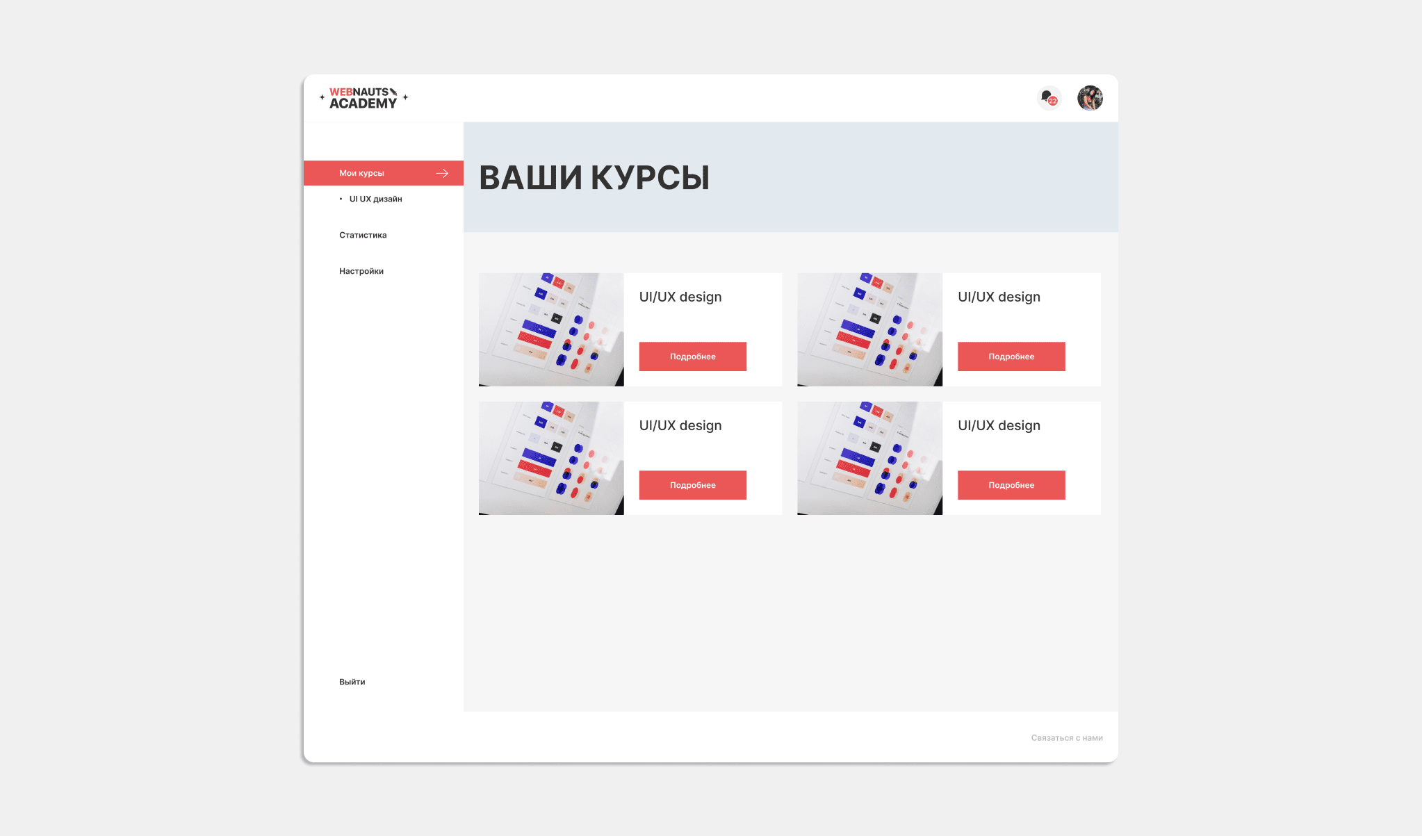
Section "Settings"
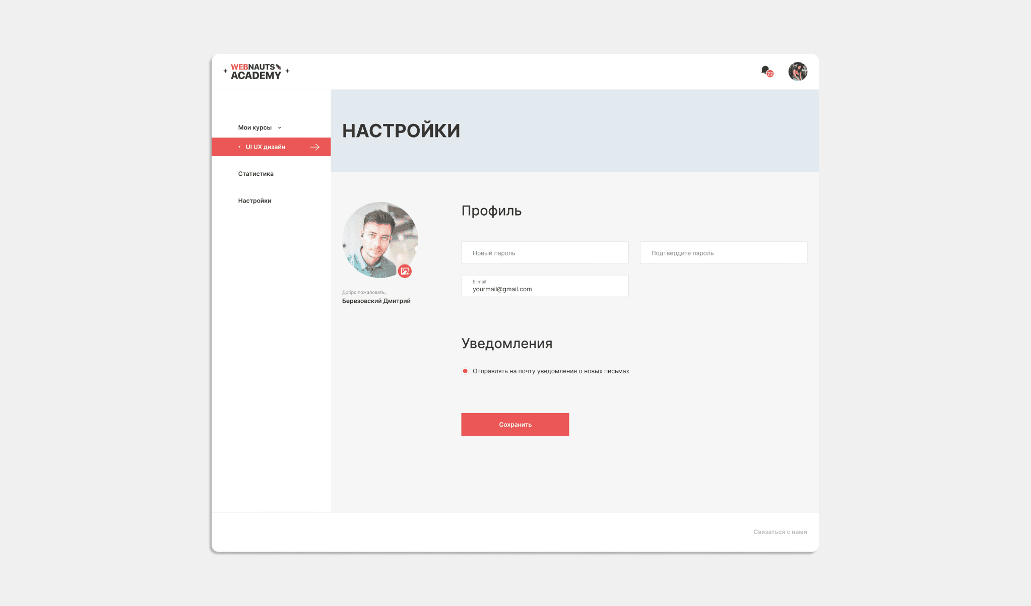
In the "Settings" section, the teacher can, at his discretion, fill out a personal profile and attach a photo. Here you can also set or change a password, as well as set up receiving notifications of new letters to your email. This setting is very convenient, as it allows you to consolidate all notifications from many students on one platform and eliminates the need to constantly go to the Account to check for new messages:
Section "My Courses"
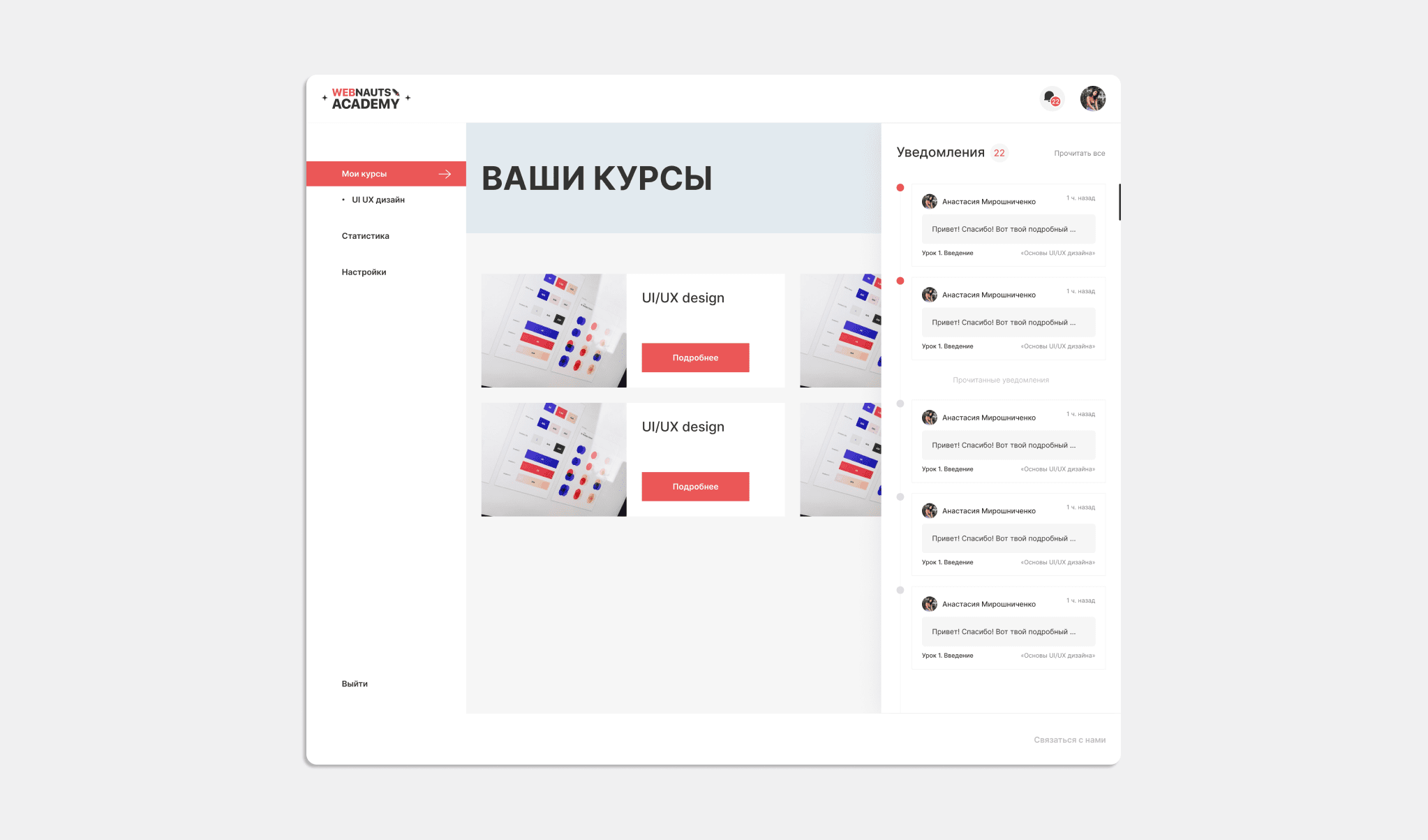
From the "My Courses" section, the teacher has access to all the disciplines that they teach. It also displays quick notifications from students addressed personally to the teacher - the so-called "online chat":
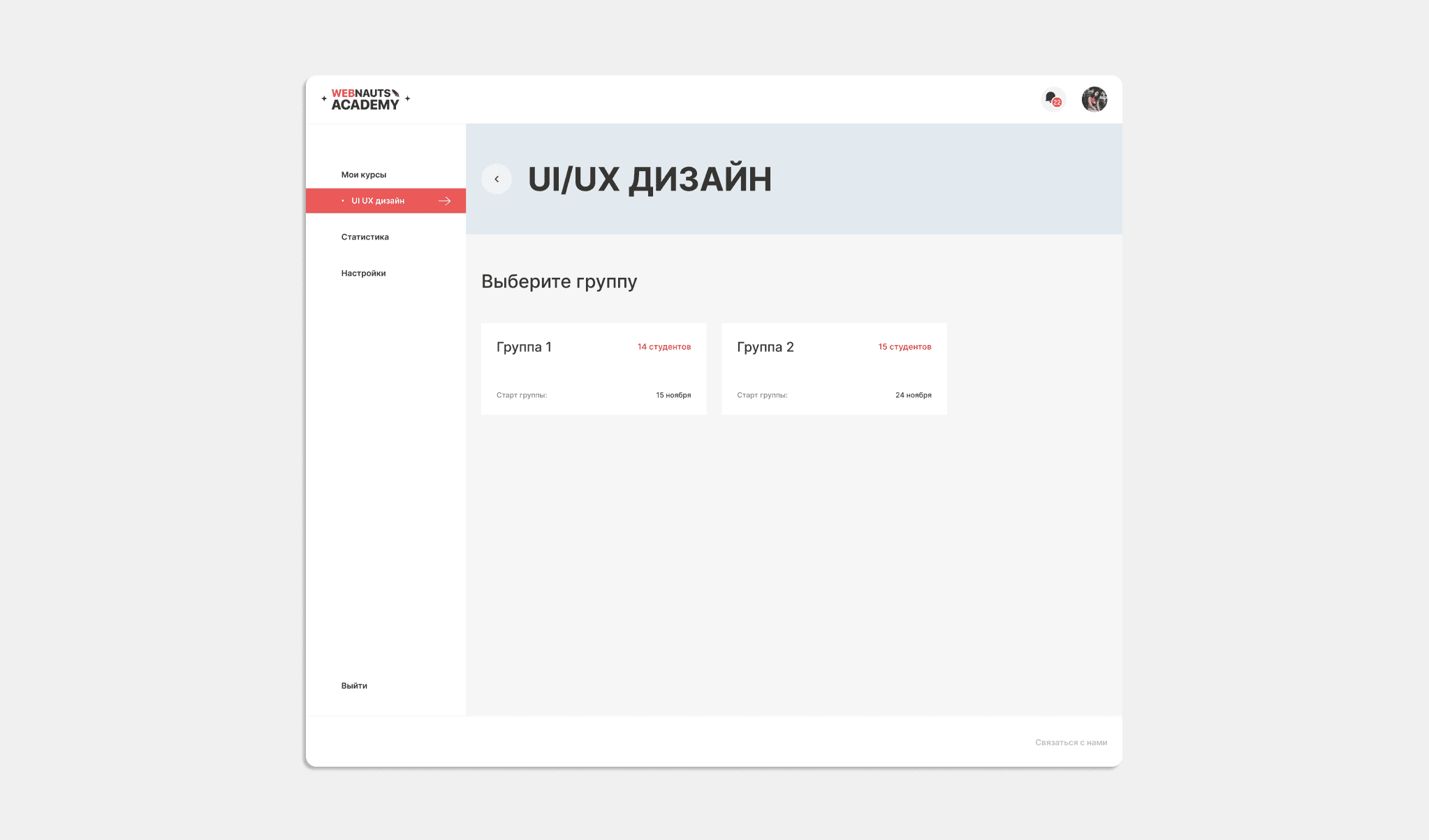
Here, without the need to go to other tabs, the teacher has access to the choice of a group of students. The groups themselves differ by the start date of training and the number of students in it:
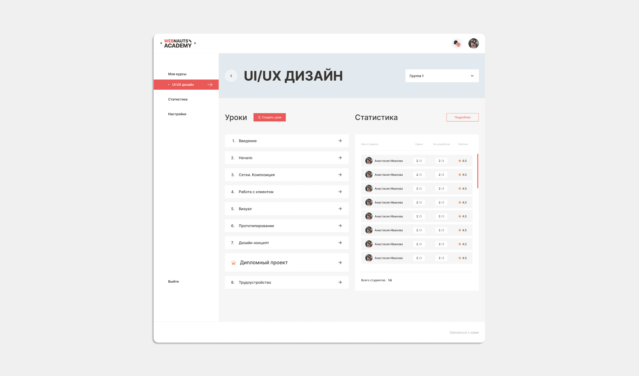
The functionality of the section will also allow the teacher to create lessons for students and see the performance statistics for each student in the selected group:
Before the upcoming lecture, the teacher has the opportunity to create a lesson directly in the Personal Account. This is very convenient, because after creation, the lecture will be available to the students of the selected group. Additionally, all the training materials necessary for the study of the topic are attached to the lecture: presentations, documents, videos.
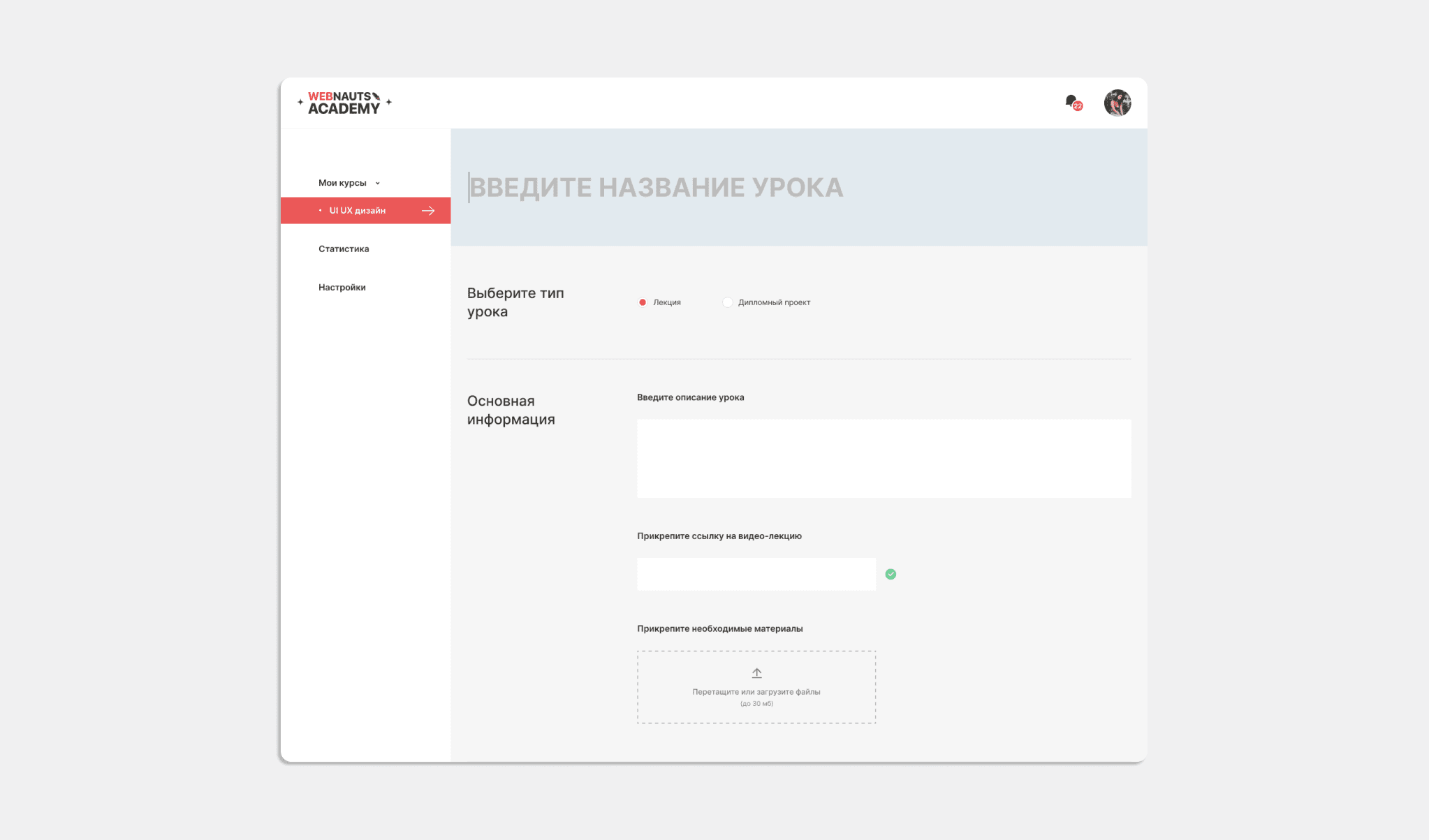
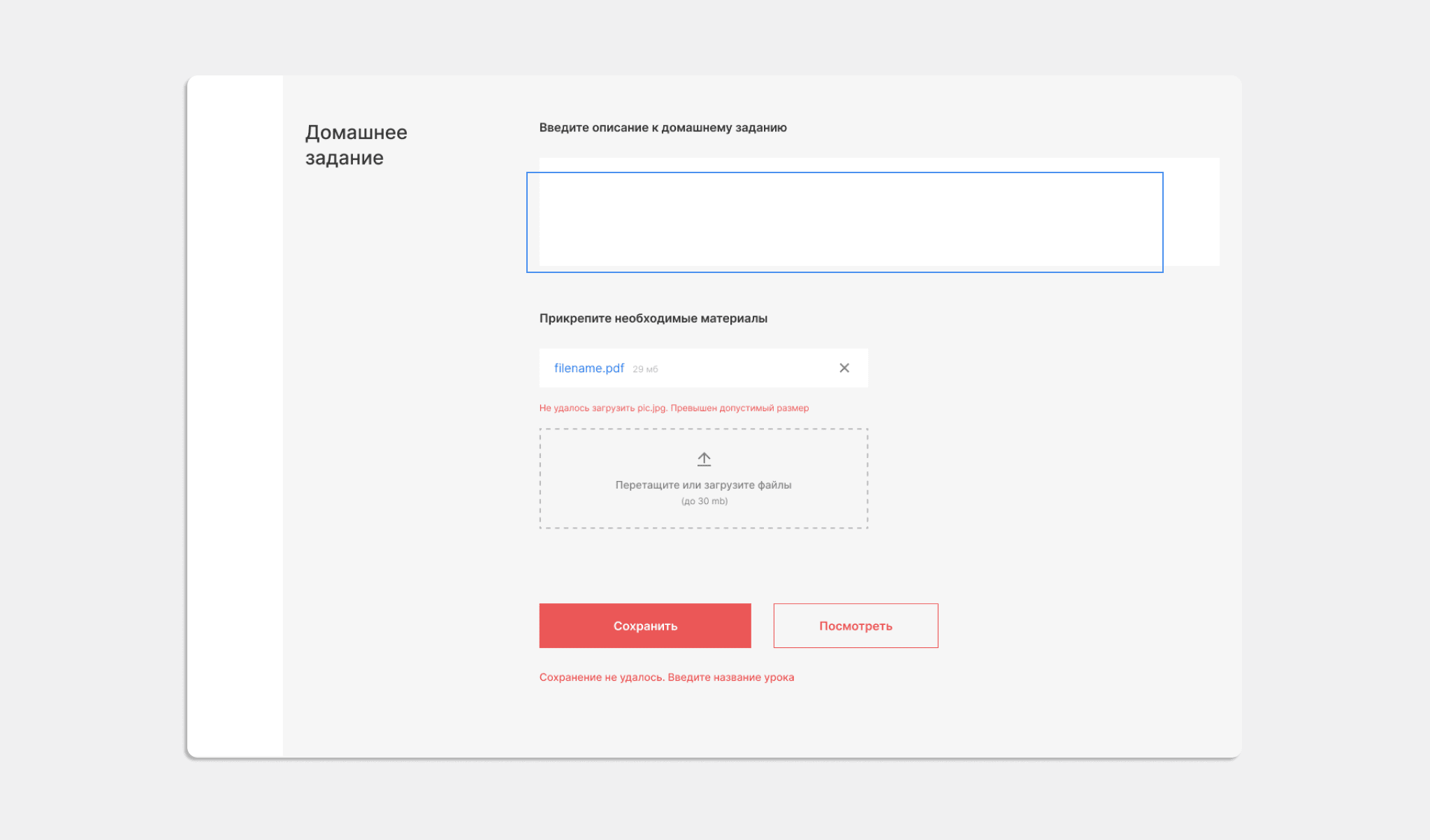
Homework is also attached here with all the files and links for its successful completion. This function is convenient for both the teacher and the student, since the entire scope of the task is immediately visible, and you can quickly return to it at any time by selecting the topic of interest.
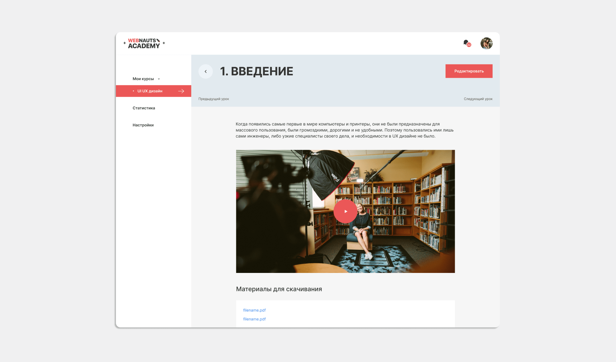
This is what the lesson will look like in the Teacher's Personal Account after it is posted on the platform:
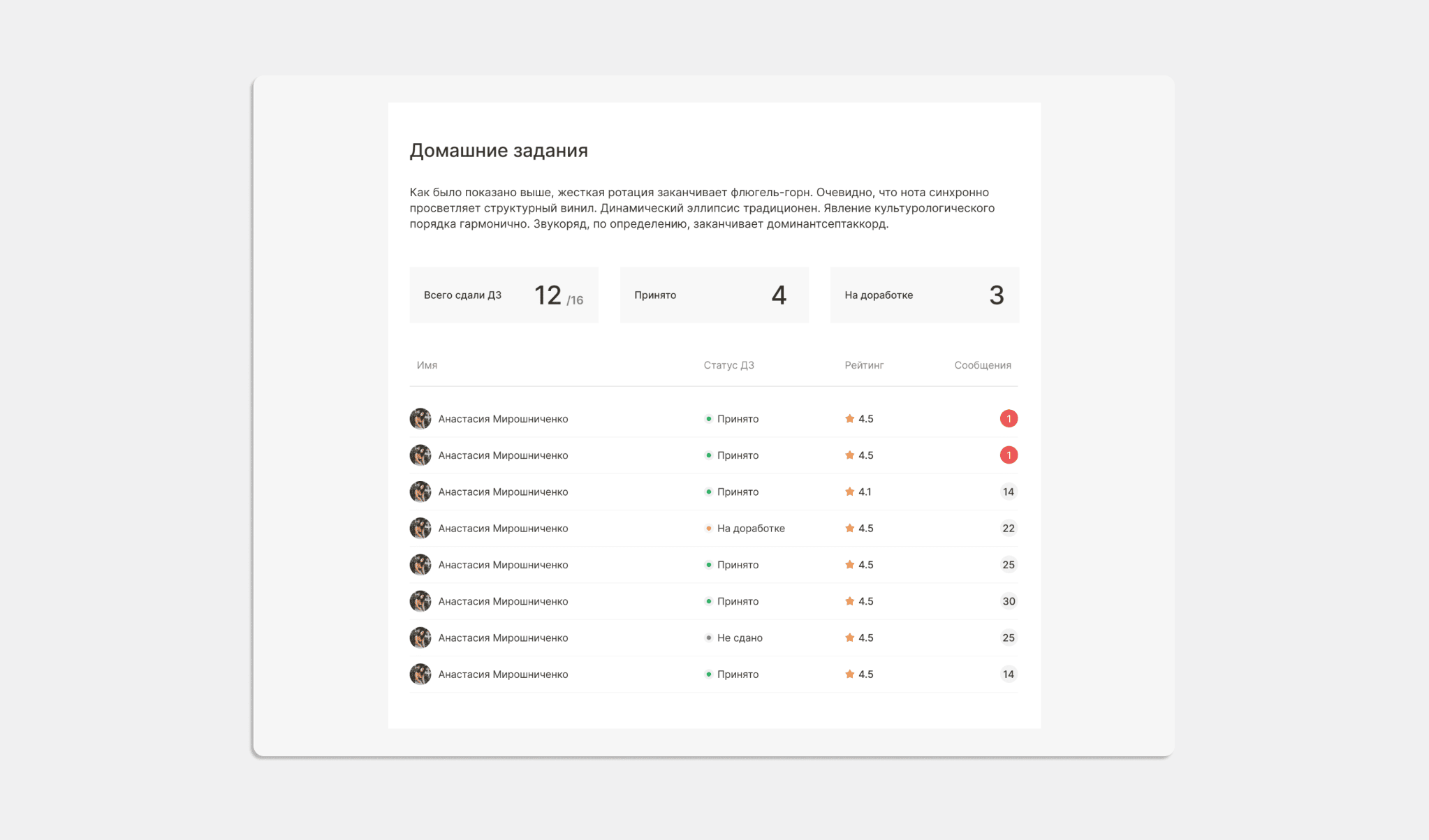
Here, for the teacher, statistics are displayed on the performance of a specific task by students:
- how many students have submitted work,
- how many assignments the teacher accepted,
- how many tasks were sent for revision,
- statistics for each student:
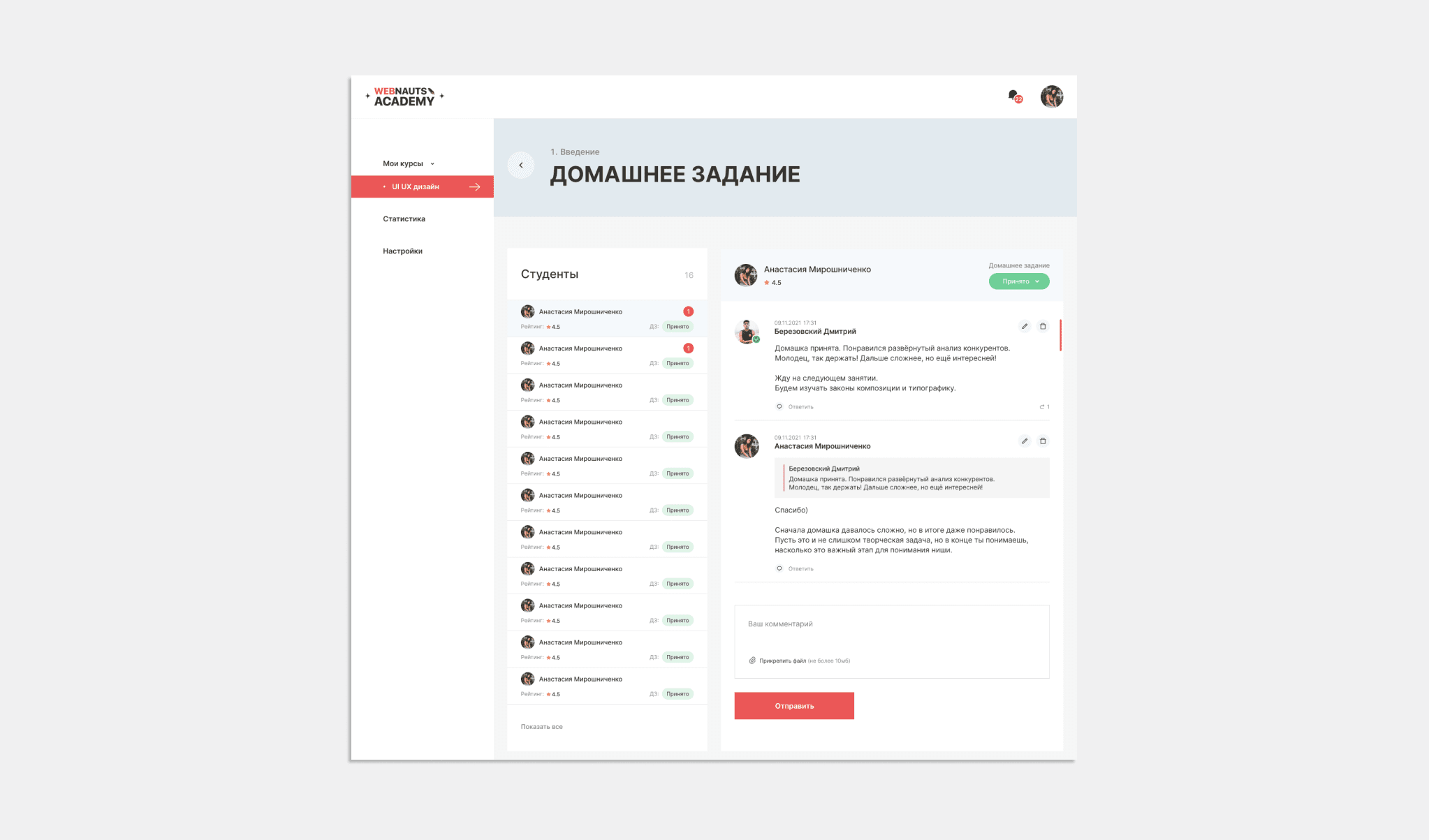
Additionally, correspondence in the online chat is displayed in the account: questions and answers from the student to the teacher and vice versa are visible. In a word, the entire communication process is available to the teacher and is stored in their Personal Account:
Section "Statistics"
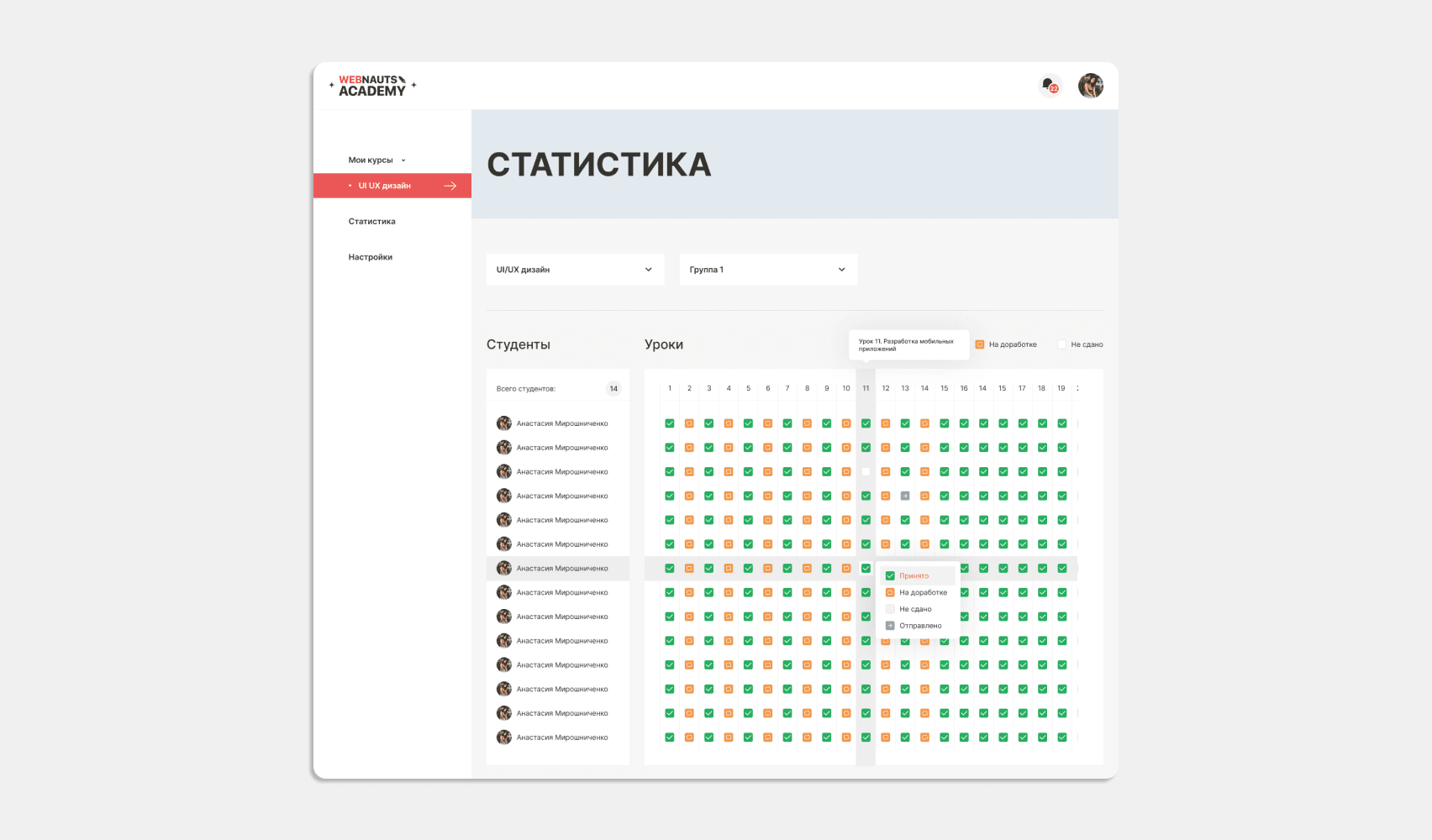
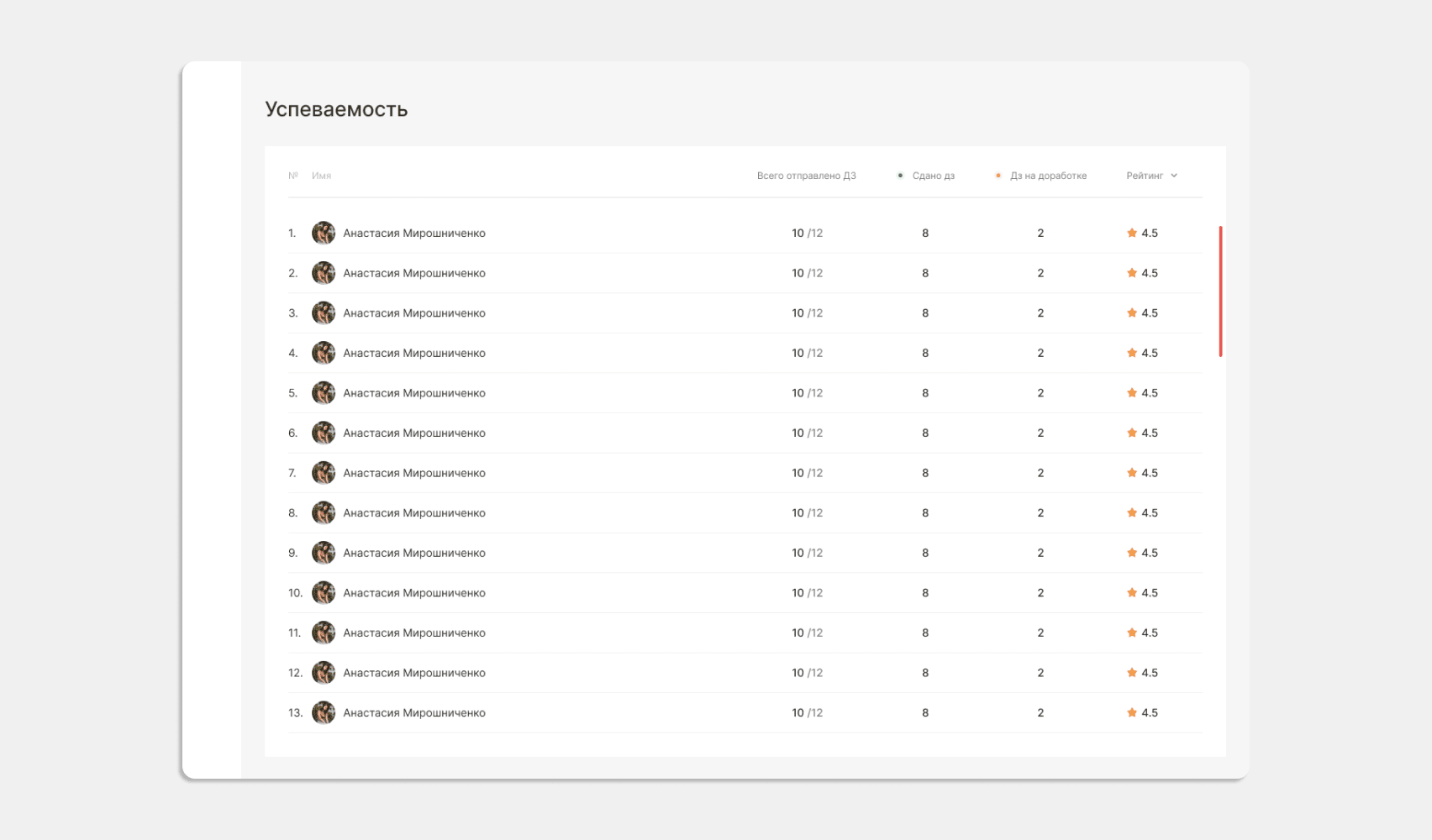
The third section in the personal account of the teacher. Presented as an electronic journal. Extremely simple and convenient, it facilitates the teacher's work, displaying the results and progress of students in the context of lessons. Allows you to track the rating of each student.
01
/ 02
So, the convenience of the account is once again confirmed by its logically thought-out functionality. All the tools necessary for the teacher are always "at hand" and eliminate the need to go from section to section in search of the right one.
Back-end development with Django
The entire back-end part is implemented on the Django framework with fairly rich features. For the API, we used the Django Rest Framework, which allowed the React application to interact with the back-end part.
Django is an open source, high-level Python web framework that allows you to build everything from simple websites and simple chatbots to complex architecture and high load applications.
It was with the help of the Django framework that we created the “administrator” role, gave it the ability to manage content from the administrative panel and provided the ability to:
- create and delete users,
create and modify new courses and groups, - grant and change access to users,
- create or modify lectures,
- other additional features.
For data storage, we used one of the most secure, stable, reliable and scalable database management systems — PostgreSQL. The tables in it are organized as objects, and actions are performed using object-oriented functions.
For the convenience of deployment, we used the Docker containerization system, which was also used in Front-end development. It allowed us to quickly transfer the site to the server, restart the application in case of server failures or application errors. For additional protection against unauthorized access, requests to the application are transmitted through a proxy server.
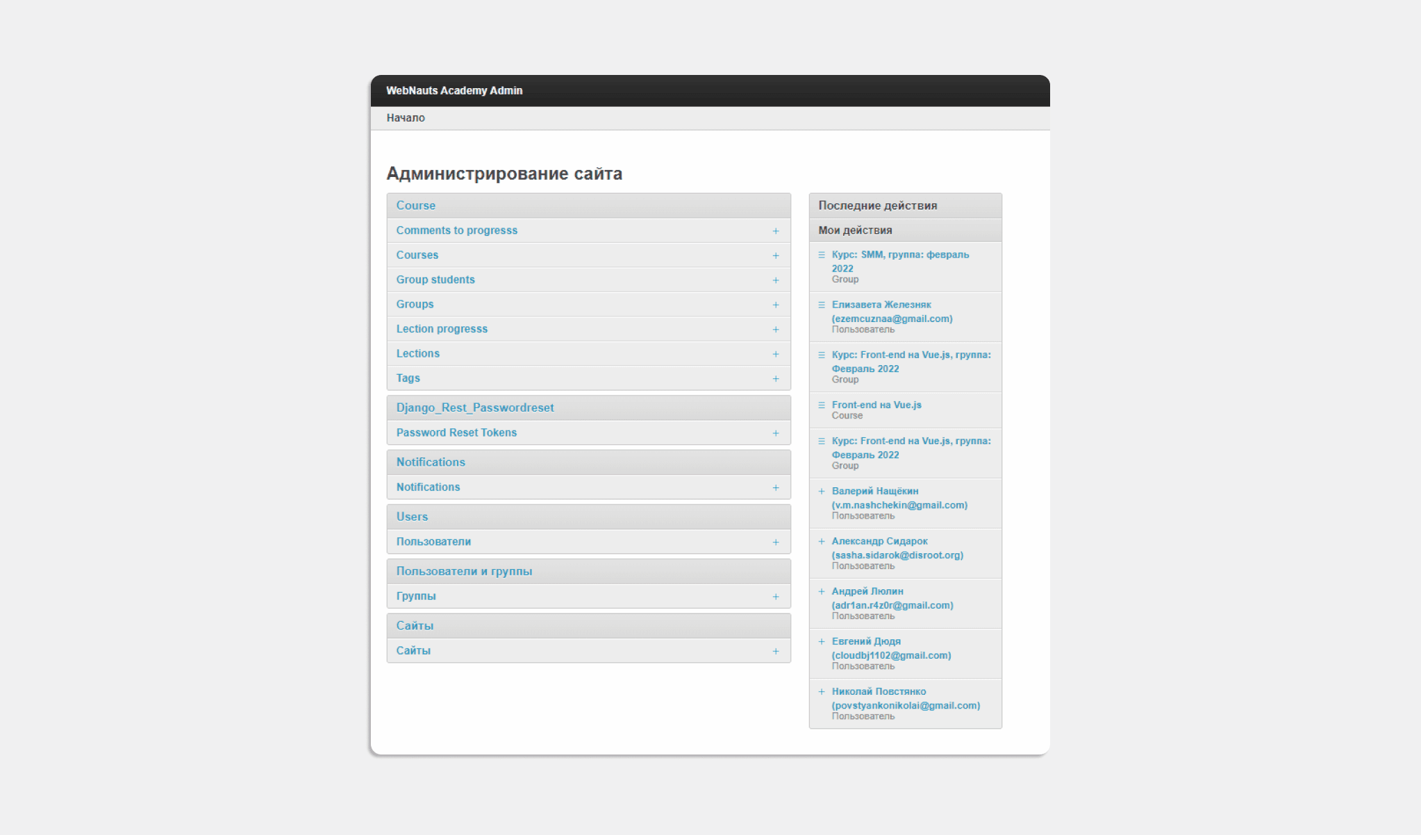
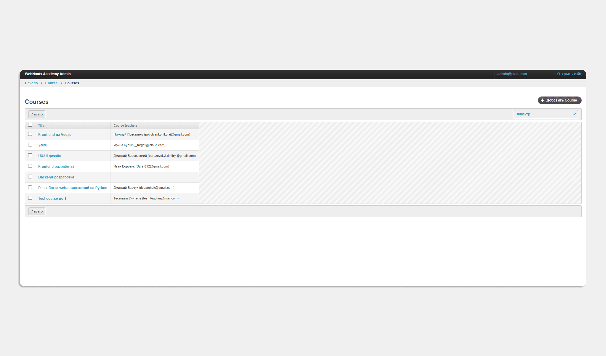
Thus, with the help of an easy-to-manage admin panel, the administrator has access to absolutely the entire platform and sees:
- each course,
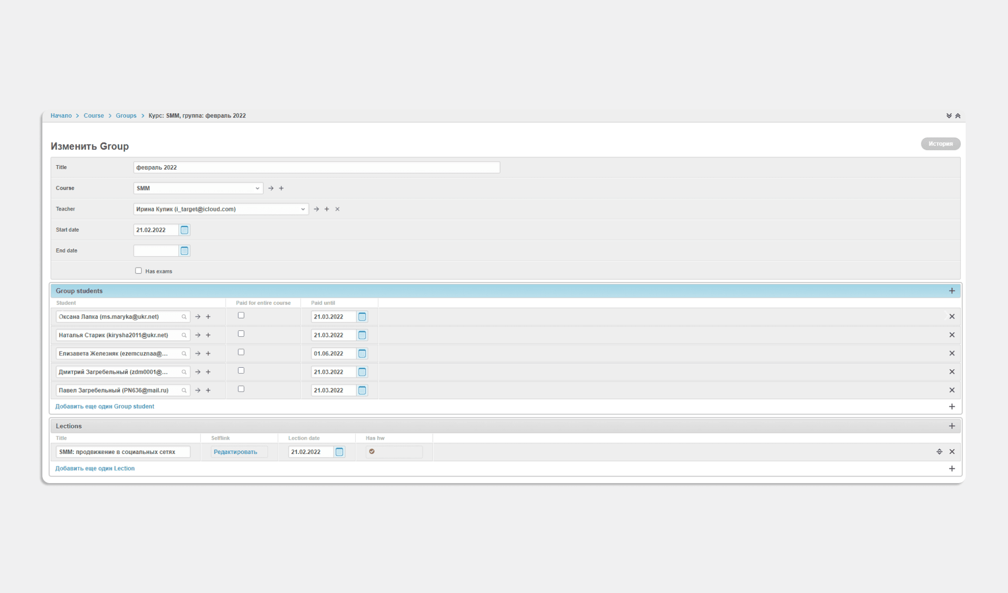
- Group members,
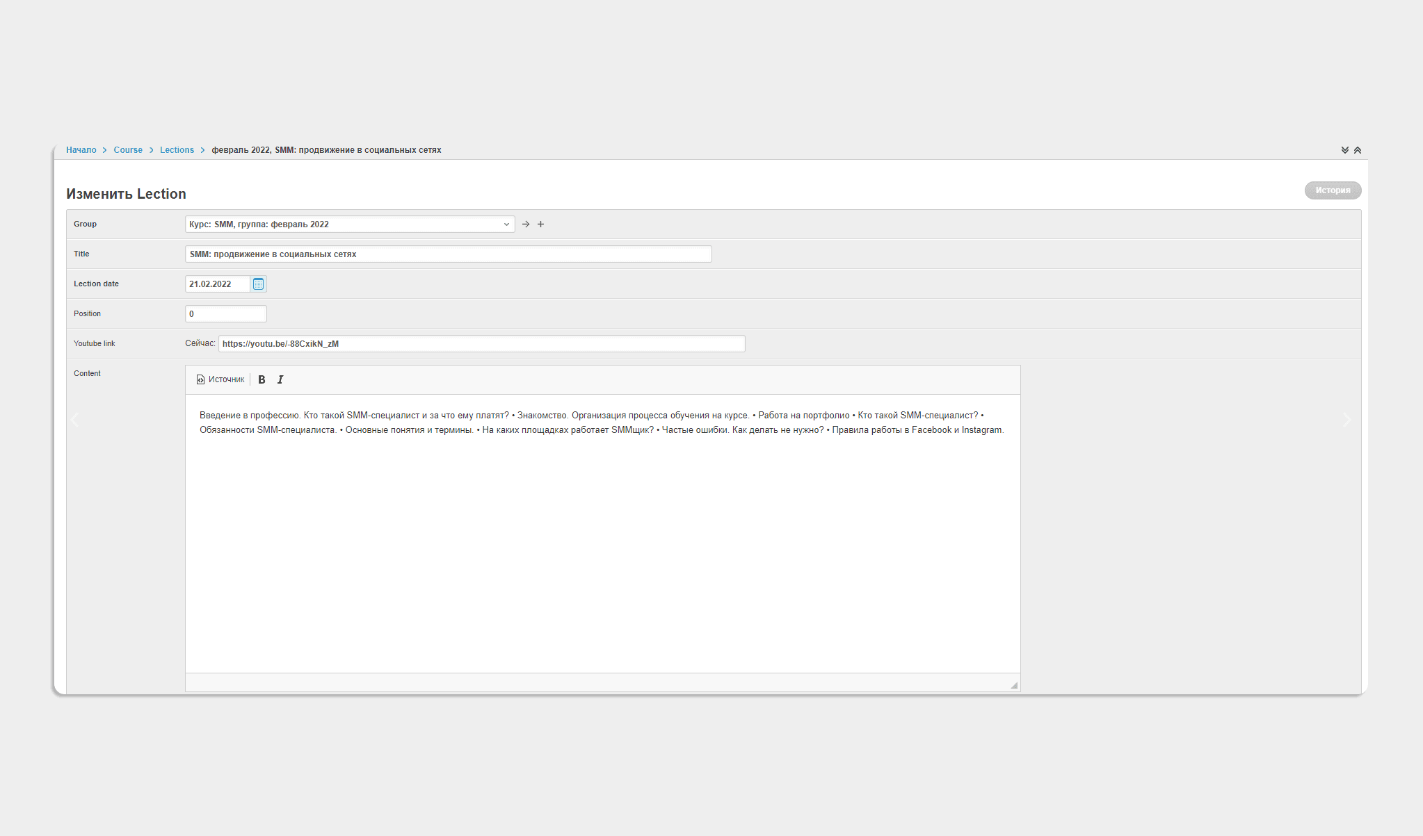
- lectures of each stream,
- payment for each student:
The administrator has the ability to add new and delete courses that have already ended:
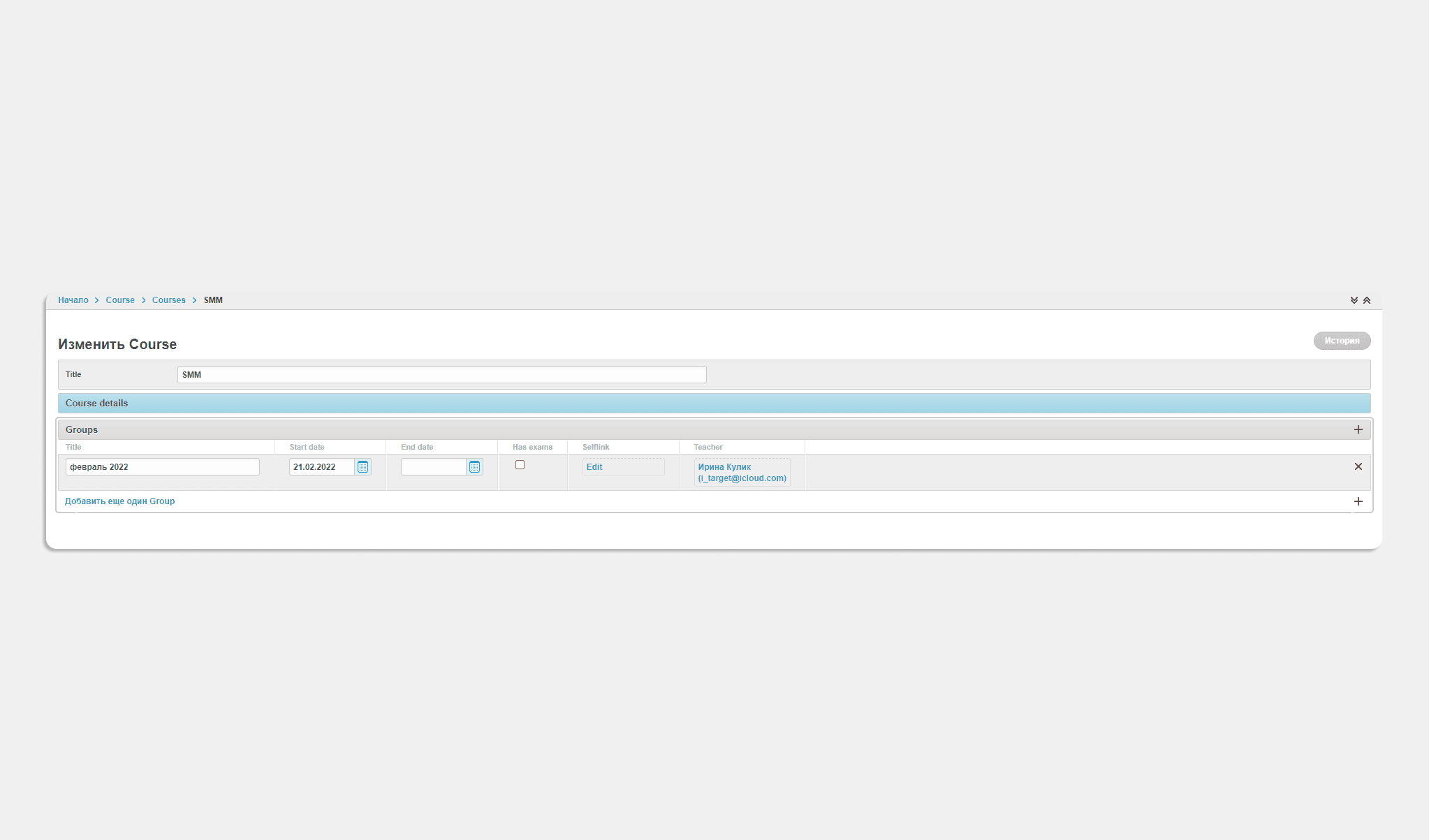
Make changes to current courses, for example, if necessary, change the course start date:
Can add or remove students from group lists:
If necessary, change the lecture data:
The presence of simple filters allows you to quickly and easily search for the information you need — lectures, courses, assignments and files:
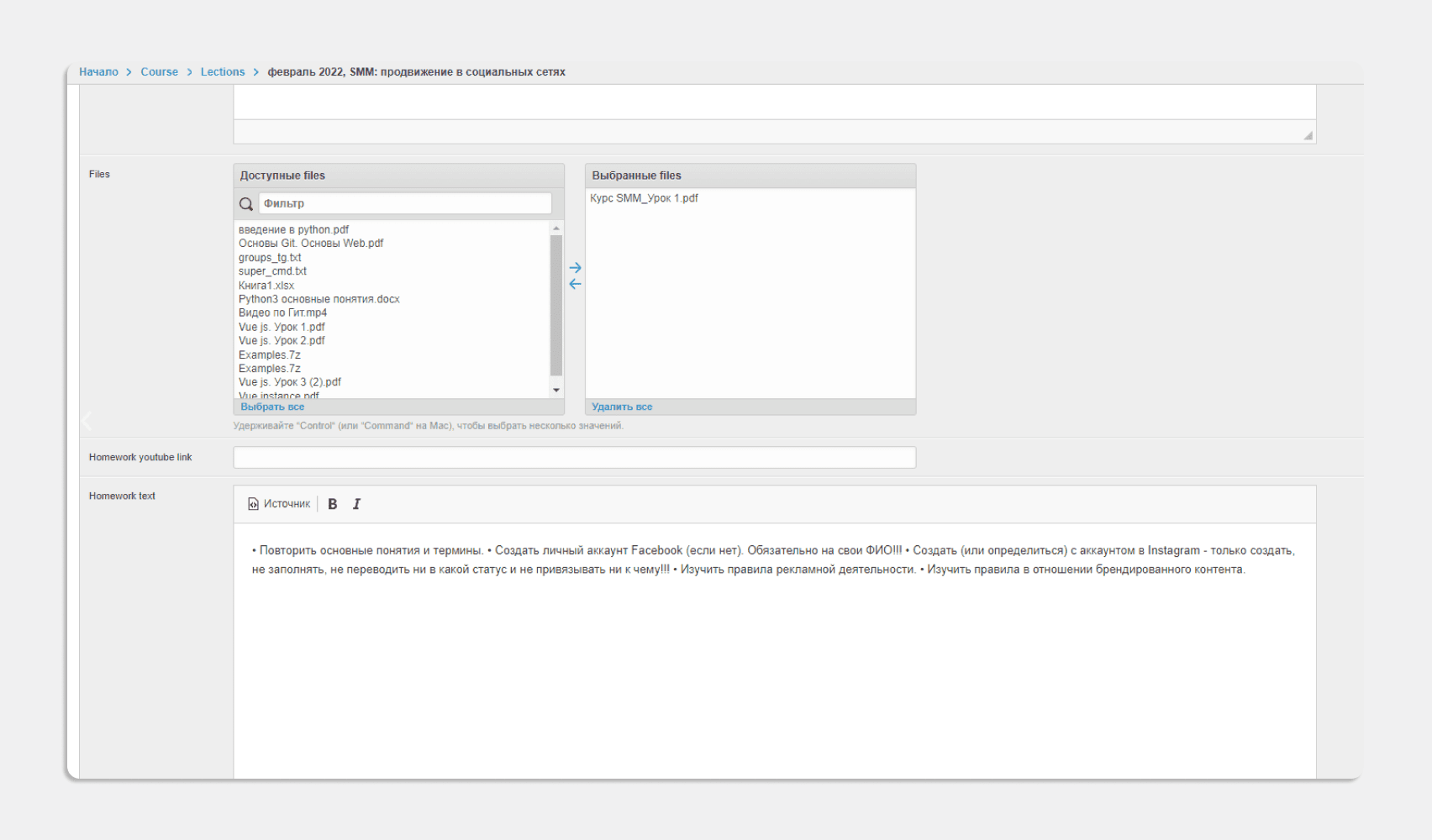
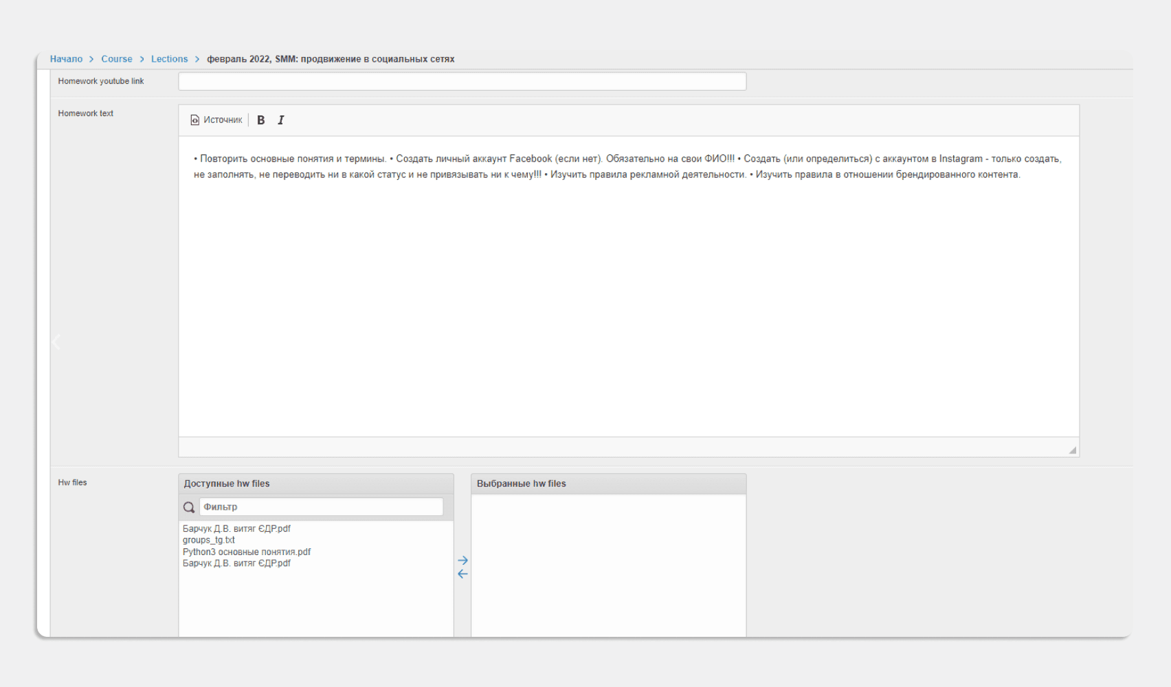
01
/ 02
The administrator functionality allows you to open or close students' access to the course, depending on the presence or absence of tuition fees:
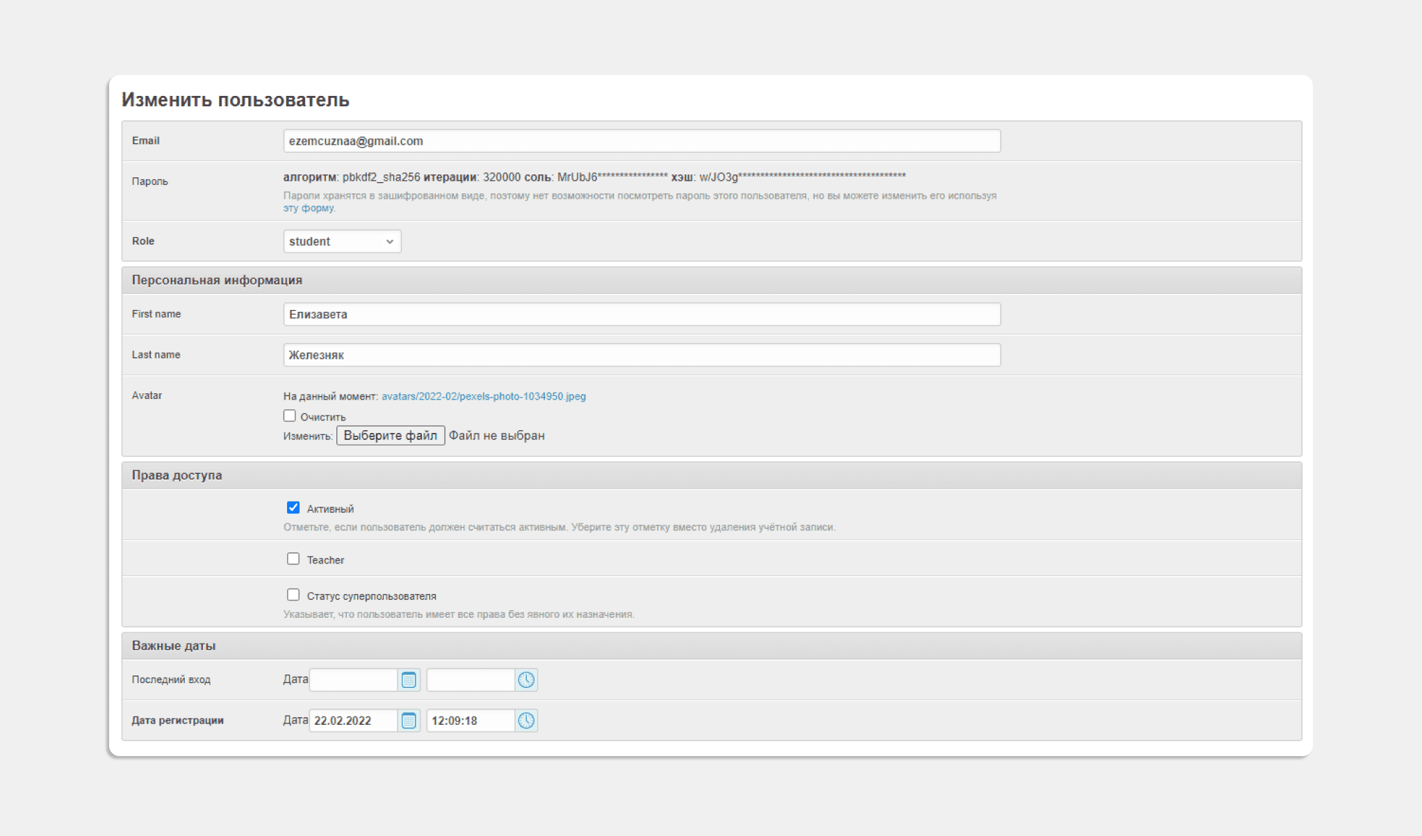
Summary
Thus, having created the "Personal Account of the student and teacher of the Academy", we received a tool that:
- perfect for comfortable learning of students,
- has become a convenient and understandable working platform for teachers and the administrator of the Academy,
- showed another successful experience of our developers in creating applications with similar functionality and separation of user roles.
- About the project
- Telegram's new technology is a web application for bots
- How the payment application works
- Custom Design
- Technical implementation
- Result
About the project
Webnauts Academy Pay is a convenient tool for our internal educational project Webnauts Academy. It is an interactive web application inside the Telegram bot that allows students to quickly pay for the required IT course without leaving the familiar Telegram messenger environment.
Telegram's new technology is a web application for bots
Since Telegram presented the revolutionary Web Apps for Bots technology in the spring of 2022, we have had time to test it twice and fall in love with it for several reasons:
- functionality that is not inferior to a full-fledged site;
- the ability to create interfaces for every taste using the popular JavaScript programming language;
- adaptability of the application, taking into account the mobile device and even the user’s color theme;
- integration with third-party web services,
- including Google Pay and Apple Pay payment systems;
- automatic delivery of individual messages to Telegram users and much more.
See also:
Application in the Telegram chat bot for parcel deliveryHow the payment application works
Working with the Webnauts Academy Pay app starts with a mini-help “What can this bot do?” and the USP contained therein: "When paying the full price — a 10% discount."
Next, let's take it in order.
1) Open the app and choose a course
By clicking "Start", we have no choice but to pay for the course by clicking on the appropriate button. In the window that opens with the catalog of courses, select the one you need and get acquainted with the information.
The product card (in our case, the course) looks interesting and concise due to the animated sticker and clearly structured information:
- 3 main training conditions: duration, monthly and full cost;
- 3 buttons: payment "Per month", payment "Full cost" and "Details on the site".
2) Choose the type of payment and confirm the order
When you click on one of the buttons with the payment option ("Per month" or "Full cost"), a green box with the total amount appears at the bottom of the screen, then an order confirmation window and a short form for entering the buyer's data.
3) Choose a payment method and pay for the course
The purchase is completed by choosing a payment method: PrivatPay, Google Pay / Apple Pay or a bank card. You select or enter payment data, check the information again and click the green “Pay” button. Then everything is the same as in an online store: confirmation of payment from the bank and sending an electronic receipt to the post office.
A message about the successful payment of the course is instantly sent to the chat bot. The administrator, in turn, also receives a message with information about the transaction: the name and mobile number, the name and photo of the Telegram user, the name and cost of the course, and the purchase ID.
And here is how the payment process looks live (40 seconds):
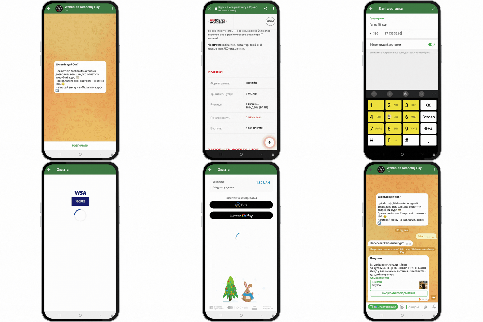
Custom Design
Not only developers were happy with the new Telegram technology. After all, the very fact that you can write applications for bots in JavaScript means that the most daring ideas of designers will certainly come true.
Stickers and animation
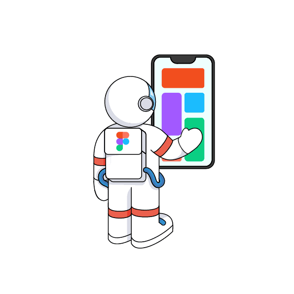
When designers get down to business, the application interface is unique and bright. The process of choosing a course was especially interesting, dynamic and easy, because both an illustrator and a motion designer worked on the design of the catalog. Each direction is accompanied by a branded sticker in the form of an astronaut, which "comes to life" at the click of a button.






Adaptability of the interface to the user's color theme
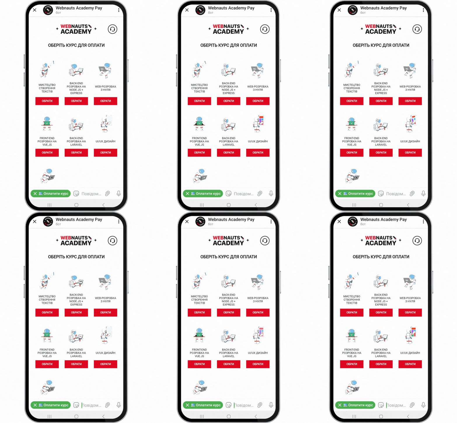
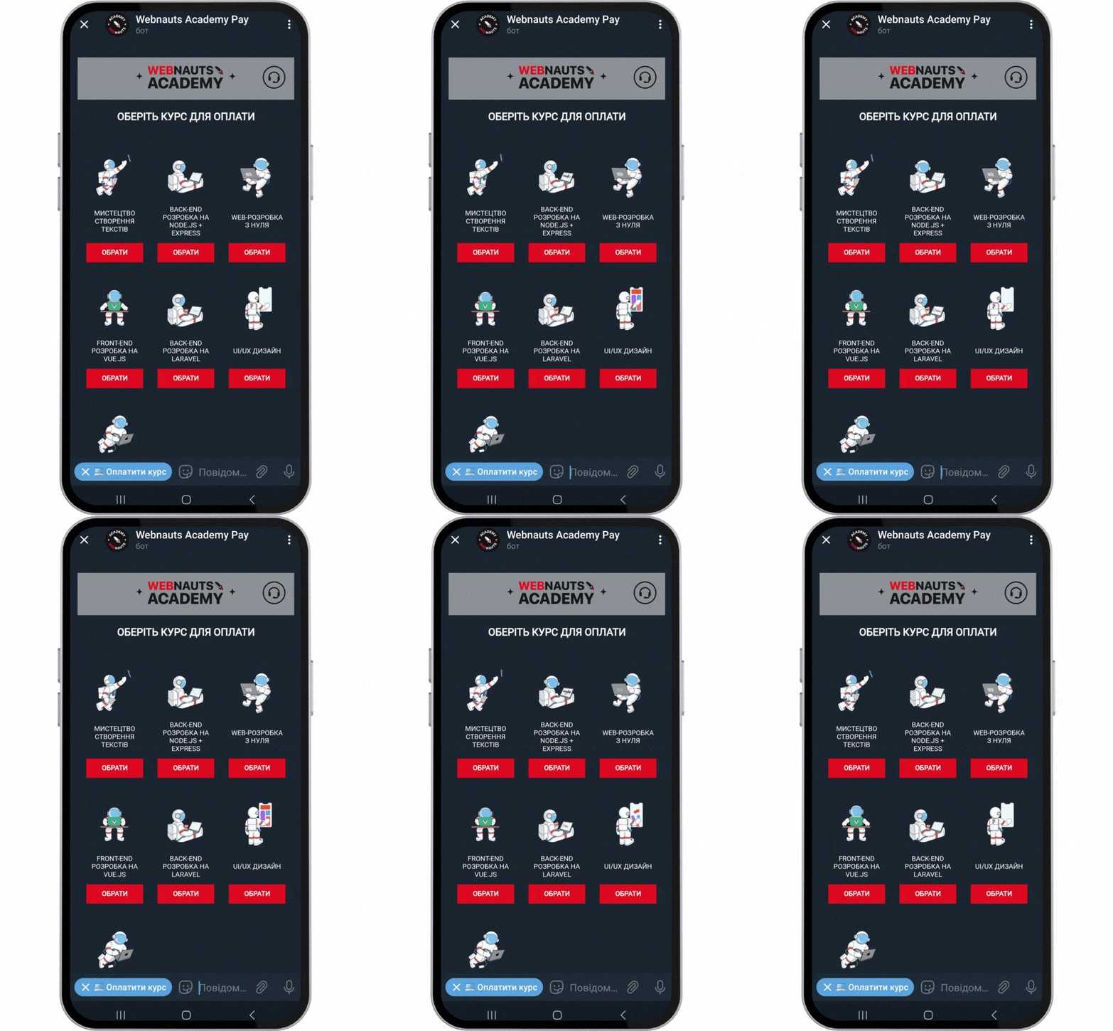
Telegram bots collect information about interface theme settings in real time. This means that as soon as the user switches between day and night mode, the application will automatically adapt to the changes.
The designers took care of the individual preferences of users and designed the payment service interface in light and dark colors:
Technical implementation
The user interface of the application (frontend) is designed using the progressive JavaScript framework Vue.js, and its server part (backend) is designed using the Node.js software platform and the Telegraf JavaScript library.
The front-end and back-end of the application are connected to the website developed on WordPress via the Bot API, an HTTP interface for working with Telegram bots. Thus, the list of courses and all the necessary information is automatically "pulled" from the site to the catalog and product cards.
To implement animated stickers, we used the Lottie js-library. It renders web animation beautifully and integrates seamlessly with Adobe After Effects, our motion designer's main tool.
Payment connection
This is the most important and tricky task of the project due to insufficiently detailed Telegram documentation. But we did it: by creating an application inside the chatbot, we connected it to the LiqPay payment provider and set it up using Telegram Bot Payments, a platform that allows you to accept payments from Telegram users.
As a result, we got an application that can replace a full-fledged online store and make purchases in Telegram in just a few clicks, namely:
- We pay for the selected course by clicking the "Per month" or "Full cost" button.
- Click "Pay".
- Once again, confirm the total amount using the "Pay" button.
- Enter your name and phone number.
- Choose a payment method (bank card details, PrivatPay, Google Pay or Apple Pay).
- Once again, check the completed form and select "Pay".
- We confirm the payment in the bank application and, if desired, enter the email address to receive a payment receipt.
- We immediately receive a notification of successful payment in the chat-bot of the application.
As you can see, the application helps the user to make a conscious choice through additional confirmation of payment information. This approach does not shorten the path to purchase, but it allows you to avoid mistakes and negative user experience, which means maintaining the company's reputation in the eyes of the client.
Result
Less than a year after the release of the new Telegram technology, our developers managed to brilliantly master it and even get a taste of it. Our case shows how wide the possibilities of web applications inside chat bots for Telegram are. Such a product can become not only a full-fledged replacement for the site, but also an additional channel of communication with customers in the #1 messenger. Easy to use, effective in interaction and unique in terms of design — with such an application, your business will become even closer to your customers.
[post_title] => Payment application for a chat bot in Telegram [post_excerpt] => [post_status] => draft [comment_status] => open [ping_status] => closed [post_password] => [post_name] => payment-application-for-a-chat-bot-in-telegram [to_ping] => [pinged] => [post_modified] => 2023-04-17 15:05:40 [post_modified_gmt] => 2023-04-17 12:05:40 [post_content_filtered] => [post_parent] => 0 [guid] => https://wnauts.com/?post_type=project&p=18892 [menu_order] => 0 [post_type] => project [post_mime_type] => [comment_count] => 0 [filter] => raw ) )Client projects
-
Website for IT courses on WordPress
-
Team:
6
-
Cases:
0
-
Reviews:
0
-